
Introduction
In today’s fast-paced business environment, data visualization is critical for communicating insights effectively. Have you ever used an AI chart maker to build a visual, only to realize the data was slightly off or the colors didn’t match your brand? While AI chart generation is incredibly powerful for brainstorming and getting a quick head start, static AI results often fall short when it’s time to present to your team or clients.
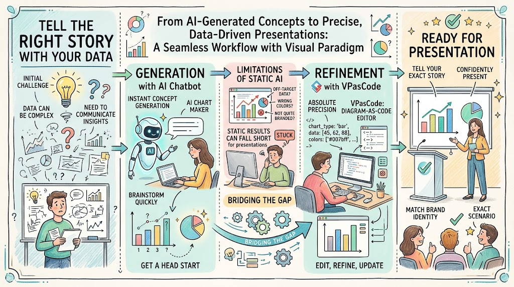
In the real world, you need the flexibility to edit, refine, and update your data to match your exact scenario. Visual Paradigm bridges this gap by offering a seamless, end-to-end workflow: generate your initial concept instantly with an AI Chatbot, and then refine it with absolute precision using Visual Paradigm VPasCode, a powerful diagram-as-code editor. This guide explores how you can leverage this complete ecosystem to tell the right story with your data.
Part 1: AI Chart Generation – Create with Chatbot, Edit with VPasCode
Our chatbot-powered AI chart generator supports a wide variety of chart types, making it easier than ever to meet your diverse data visualization needs without starting from scratch.
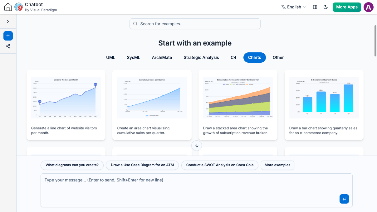
Explore More Chart Types for Any Scenario
Whether you need simple trends or advanced data maps, our AI chart generation tool can create a massive variety of layouts directly from your text prompts, including:
- Classic Formats: Line charts, Area charts, and Bar/Column charts (including stacked options).
- Proportional Breakdown: Pie, Doughnut, Nightingale Rose, and Sunburst charts.
- Performance & Tracking: Radar charts, Scatter plots, Funnel diagrams, and Gauge meters.
- Advanced Flow & Trends: Sankey diagrams and Theme Rivers.
The Complete Workflow
A truly useful AI chart maker shouldn’t just hand you a static picture and leave you stuck. With Visual Paradigm’s all-in-one ecosystem, you get a flexible workflow that gives you the best of both worlds:
- Instant Ideation: Ask the AI Chatbot to generate the chart type you need to jumpstart your design.
- Total Control: Instantly open the generated chart in VPasCode, our diagram-as-code editor. From there, you can freely edit the raw data, tweak the values, and fully customize the style to make it entirely your own.
See It in Action
Ready to test our AI chart maker yourself? Open the AI Chatbot and start with a simple request:
- Sample Prompt: “Generate a bar chart for monthly website traffic”
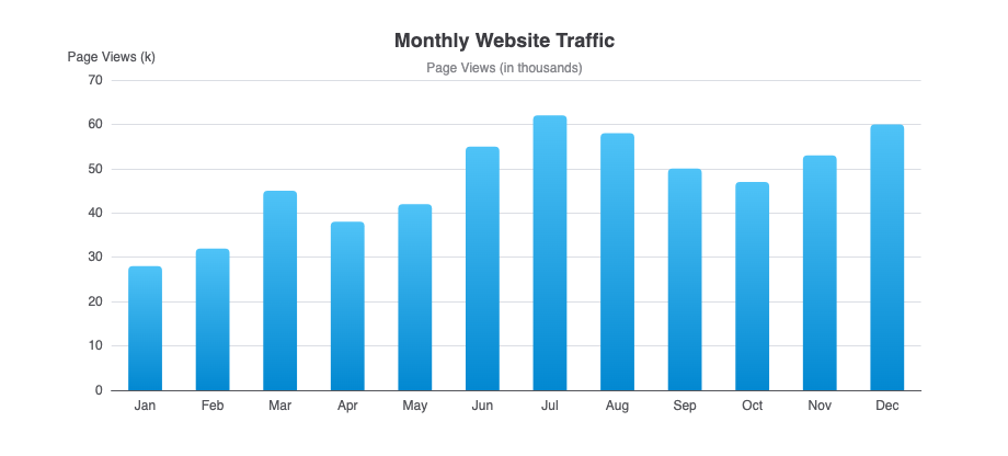
Once the chatbot builds it, simply open the chart in the VPasCode editor to plug in your exact numbers and change the colors to match your design.
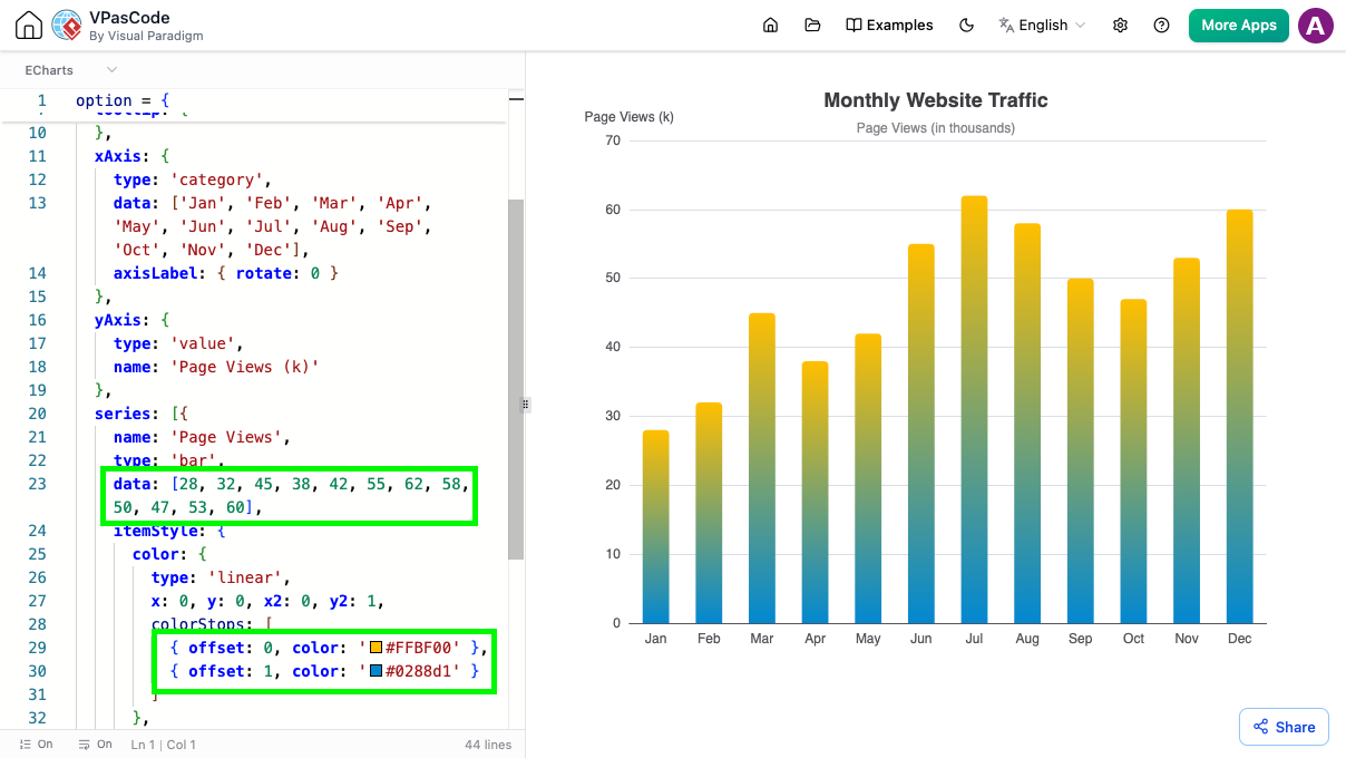
More AI Generation Examples
Below are several examples of what you can generate instantly using natural language prompts:
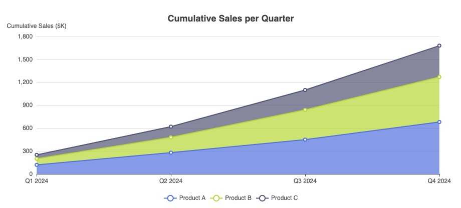
Area Chart
Sample Prompt: “Generate an area chart visualizing cumulative sales per quarter”
Line Chart
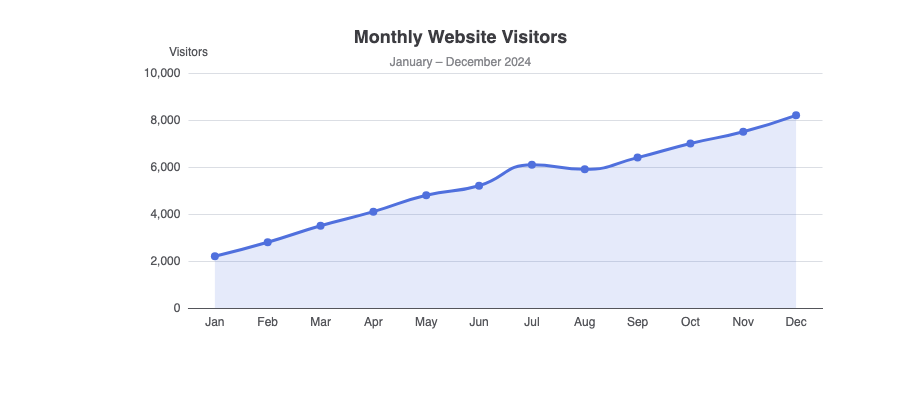
Sample Prompt: “Generate a line chart of website visitors per month”
Pie Chart
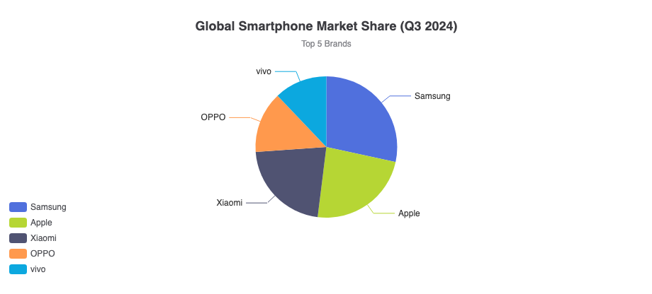
Sample Prompt: “Create a pie chart showing market share of top 5 smartphone brands”
Doughnut Chart
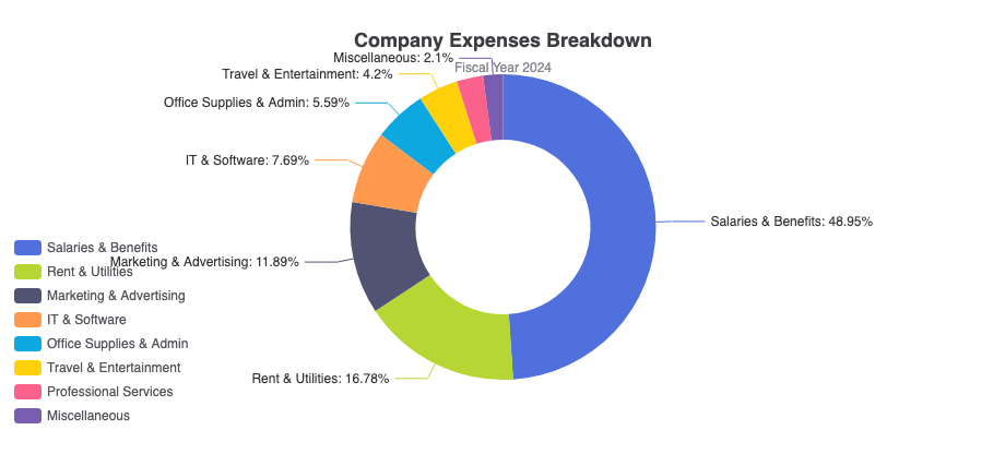
Sample Prompt: “Generate a doughnut chart showing the percentage breakdown of a company’s expenses”
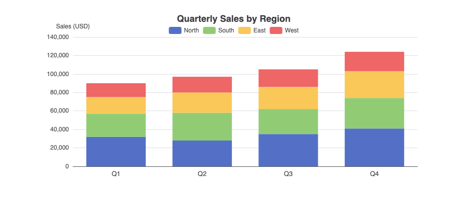
Stacked Bar Chart
Sample Prompt: “Generate a stacked bar chart showing quarterly sales by region”
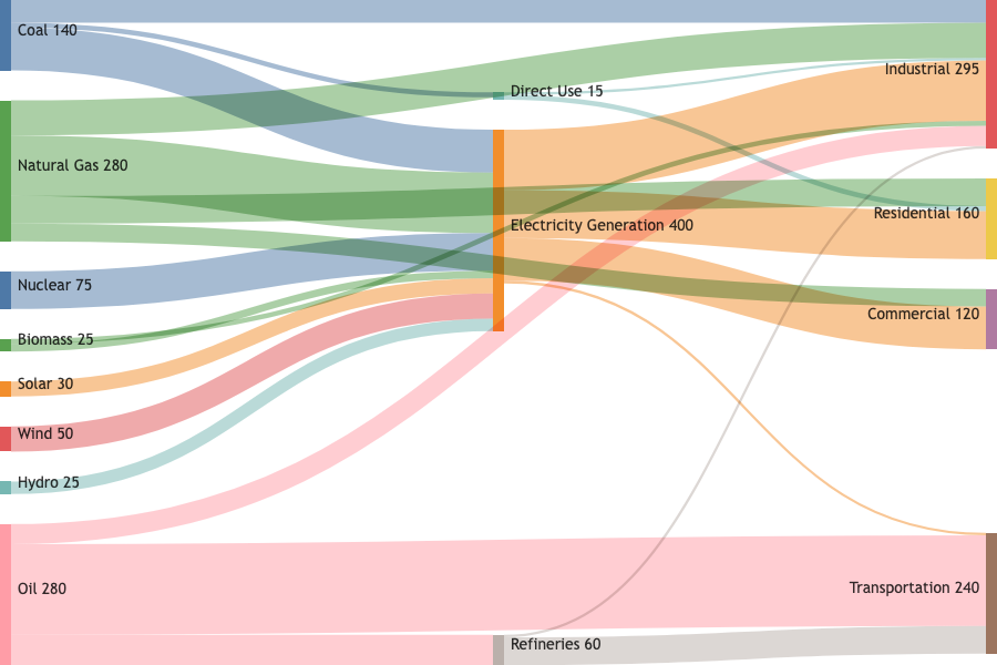
Sankey Diagram
Sample Prompt: “Generate a Sankey diagram showing the flow of energy from primary sources to end-use”
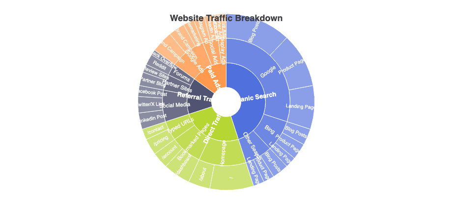
Sunburst Chart
Sample Prompt: “Generate a sunburst chart visualizing the hierarchical breakdown of website traffic, from traffic source channels down to specific landing pages.”
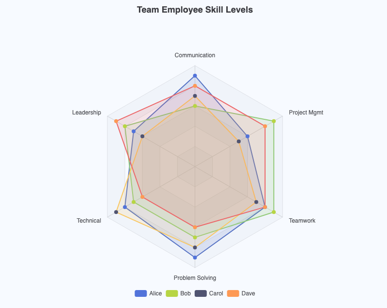
Radar Chart
Sample Prompt: “Generate a radar chart showing employee skill levels in a team”
Part 2: VPasCode – Your Ultimate Chart Editor and Text-to-Diagram Platform
At Visual Paradigm, we are constantly pushing the boundaries of how developers, data analysts, and tech professionals visualize complex systems and datasets. Recently, we introduced VPasCode, a unified text-to-diagram platform designed to eliminate the friction of shifting between multiple drawing tools. By supporting popular syntax options like Mermaid, PlantUML, and Graphviz within a single, integrated developer environment, VPasCode has quickly become a go-to ecosystem for quick, precise diagram rendering.
Today, we are thrilled to announce a major enhancement: VPasCode now natively supports Apache ECharts. This addition morphs our diagramming environment into a highly flexible, code-driven chart maker. You can now transform your JSON configurations or AI-assisted descriptions into rich, interactive data visualizations in real time.
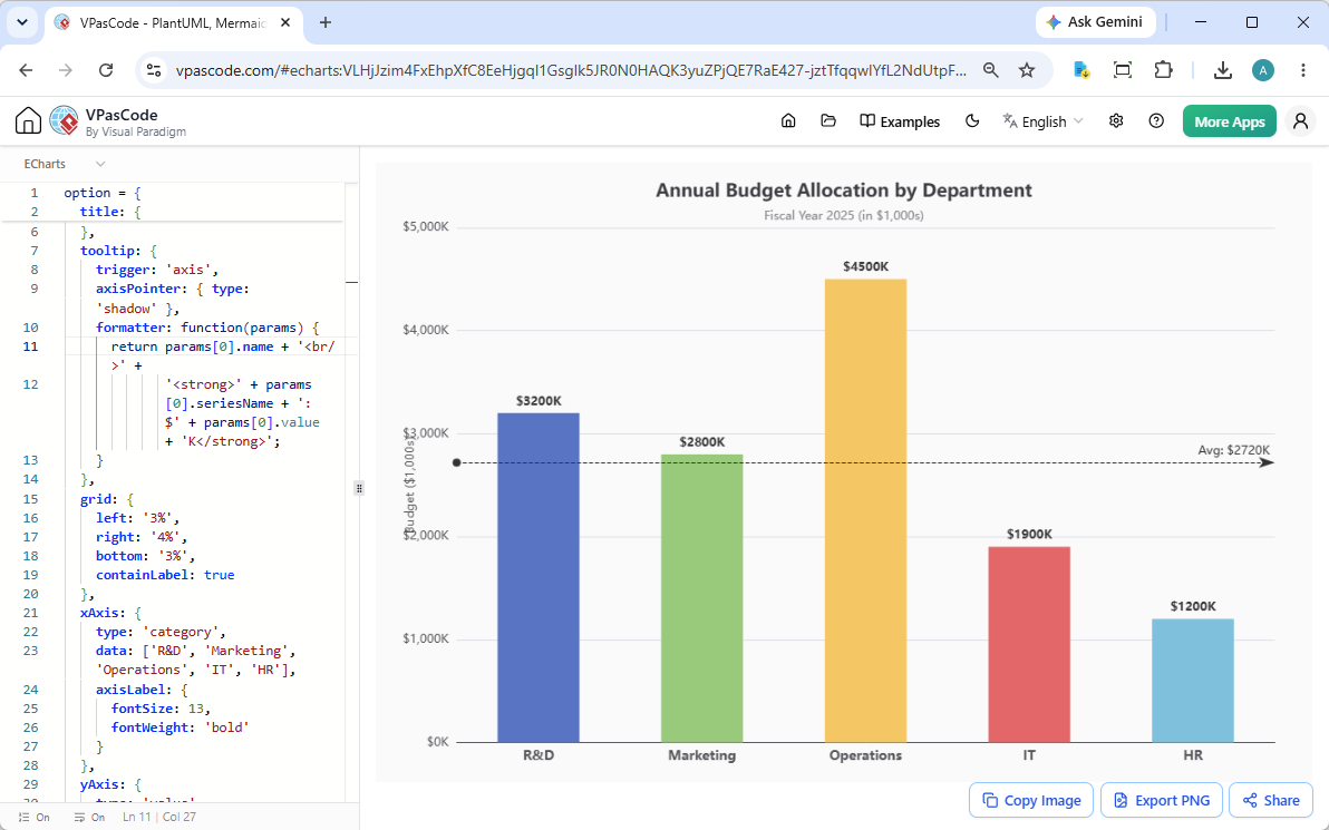
With our side-by-side interface, the mechanics remain simple and intuitive: input your ECharts configuration object on the left panel, and your interactive dashboard components render seamlessly on the right panel.
Why Choose VPasCode as Your Chart Generator?
While standard static charting software forces you to drag, drop, and manually adjust individual pixels, VPasCode relies completely on structured code. Integrating ECharts unlocks distinct advantages for modern technical teams:
- Unified Architecture: Switch effortlessly between application architecture blueprints (via PlantUML/Mermaid) and data analytics dashboards (via ECharts) within the same tab.
- AI-Driven Workflows: Leverage our platform as an intelligent AI chart generator. Describe your data requirements natively, and see accurate visualizations built automatically without manual styling.
- Highly Sharable States: Every diagram configuration is compressed into a unique, shareable URL, making it incredibly easy to collaborate on code reviews, wiki documentation, or live client presentations.
Exploring Live Examples of ECharts in VPasCode
To demonstrate the performance of our updated chart generator, we have prepared several production-grade data visualization templates.
1. Stacked Bar Chart (Regional Sales Analysis)
Perfect for looking at absolute totals across groups while breaking down categorical distributions simultaneously.
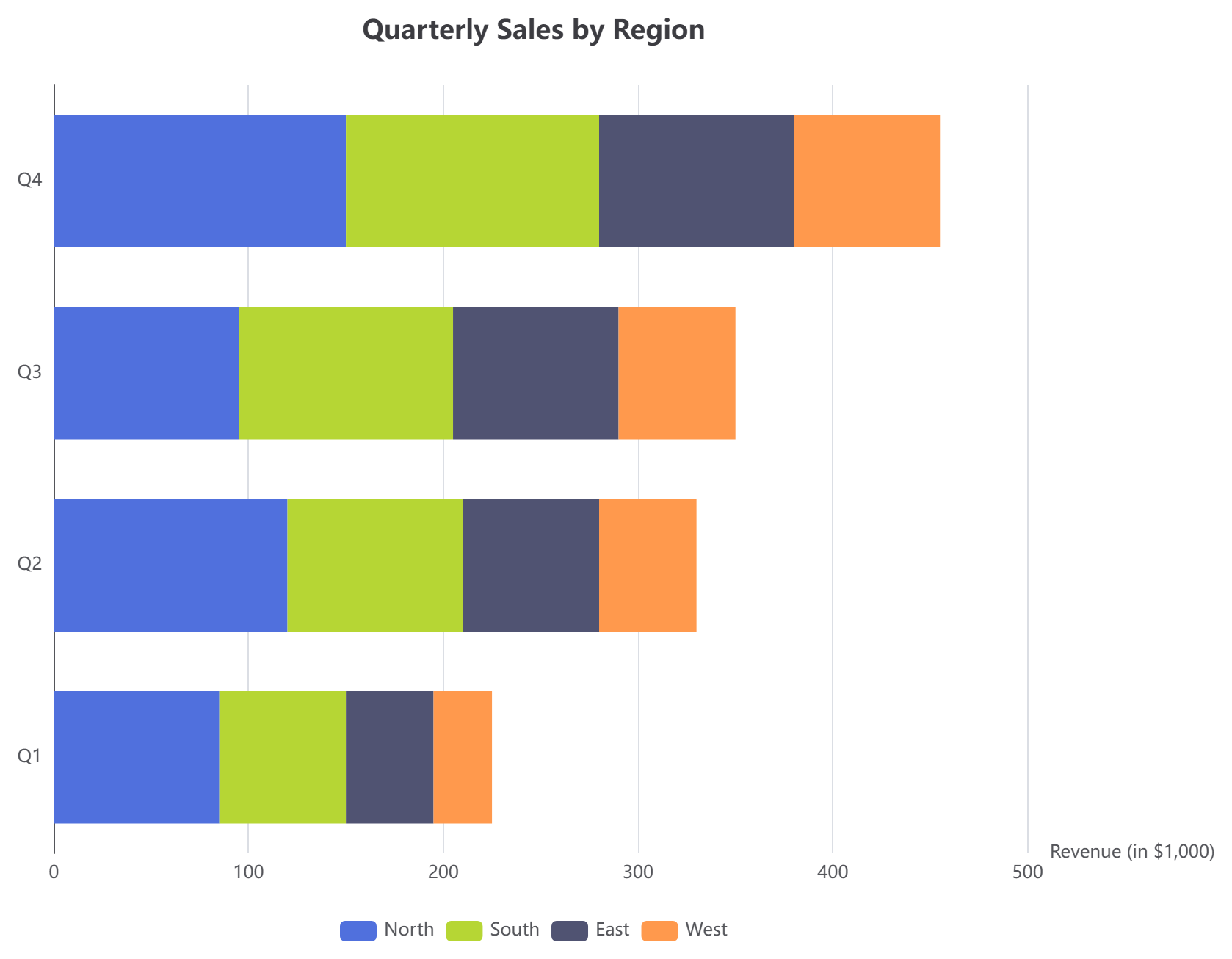
option = {
  title: { text: 'Quarterly Sales by Region' },
  tooltip: { trigger: 'axis', axisPointer: { type: 'shadow' } },
  legend: { data: ['North', 'South', 'East', 'West'] },
  xAxis: { type: 'value', name: 'Revenue (in $1,000)' },
  yAxis: { type: 'category', data: ['Q1', 'Q2', 'Q3', 'Q4'] },
  series: [
    { name: 'North', type: 'bar', stack: 'Total', data: [85, 120, 95, 150] },
    { name: 'South', type: 'bar', stack: 'Total', data: [65, 90, 110, 130] },
    { name: 'East',  type: 'bar', stack: 'Total', data: [45, 70, 85, 100] },
    { name: 'West',  type: 'bar', stack: 'Total', data: [30, 50, 60, 75] }
  ]
};
2. Line Chart with Shaded Area (Monthly Website Growth)
Designed for tracking chronological shifts with smooth interpolations and clean grid alignments.
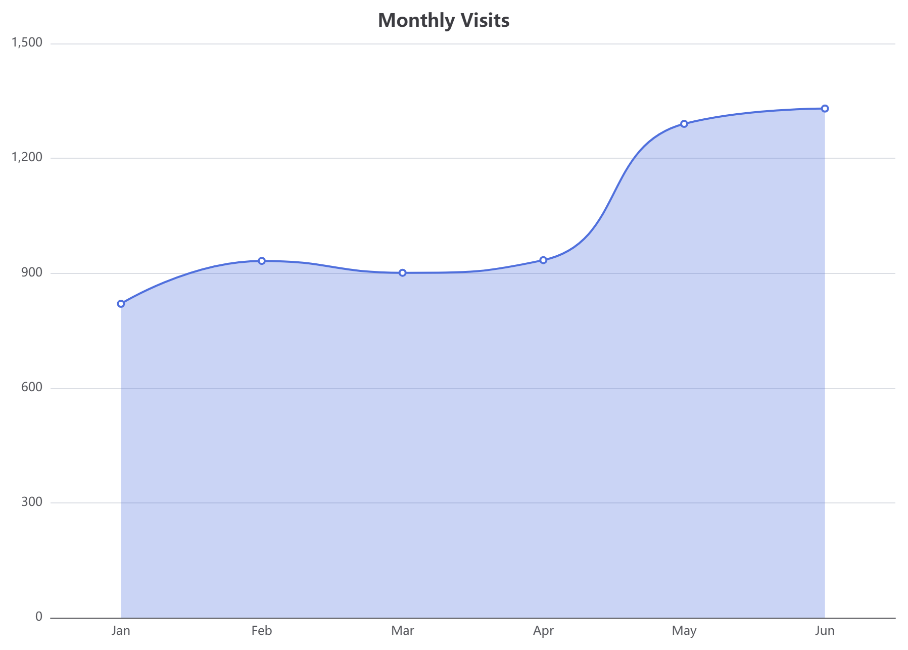
option = {
  title: { text: 'Monthly Visits', left: 'center' },
  tooltip: { trigger: 'axis' },
  grid: { left: 40, right: 20, top: 50, bottom: 30, containLabel: true },
  xAxis: { type: 'category', data: ['Jan','Feb','Mar','Apr','May','Jun'] },
  yAxis: { type: 'value' },
  series: [{
    name: 'Visits',
    type: 'line',
    smooth: true,
    data: [820, 932, 901, 934, 1290, 1330],
    areaStyle: { opacity: 0.3 }
  }]
};
3. Custom Area Chart (Bright Highlights)
An excellent showcase of styling flexibilities where line colors, boundary configurations, and filling opacity can be manipulated instantly.
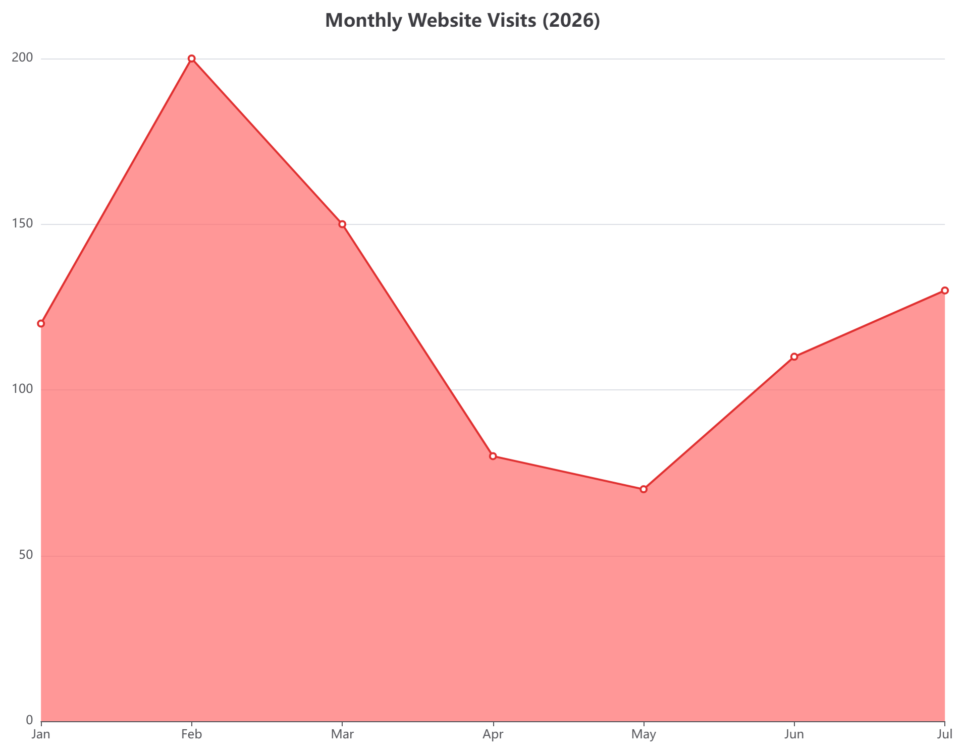
option = {
  title: { text: 'Monthly Website Visits (2026)' },
  xAxis: { type: 'category', boundaryGap: false, data: ['Jan', 'Feb', 'Mar', 'Apr', 'May', 'Jun', 'Jul'] },
  yAxis: { type: 'value' },
  series: [{
    data: [120, 200, 150, 80, 70, 110, 130],
    type: 'line',
    areaStyle: { color: '#ff6b6b' },
    lineStyle: { color: '#e03131' },
    itemStyle: { color: '#e03131' }
  }]
};
4. Interactive Pie Chart (Traffic Referral Mix)
A classic layout for computing relative market share or traffic sources, complete with a clean bottom legend container.
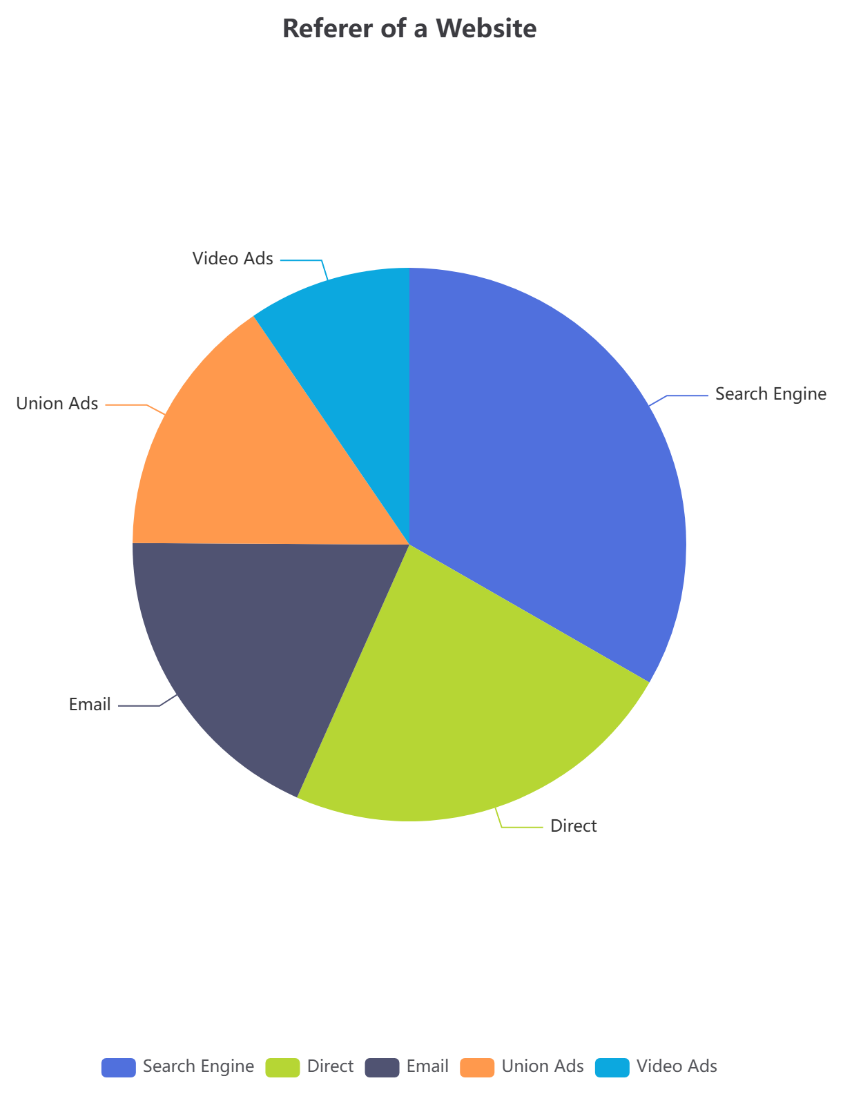
option = {
  title: { text: 'Referer of a Website', left: 'center' },
  tooltip: { trigger: 'item' },
  legend: { bottom: 10 },
  series: [
    {
      name: 'Access From',
      type: 'pie',
      radius: '50%',
      data: [
        { value: 1048, name: 'Search Engine' },
        { value: 735, name: 'Direct' },
        { value: 580, name: 'Email' },
        { value: 484, name: 'Union Ads' },
        { value: 300, name: 'Video Ads' }
      ]
    }
  ]
};
5. Radar Chart (Service Mesh Architecture Comparison)
A multivariate graph structure often used to evaluate technical capabilities, software benchmarks, or complex architecture criteria side-by-side.
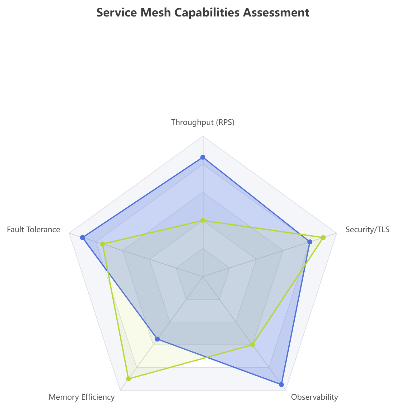
option = {
  title: { text: 'Service Mesh Capabilities Assessment' },
  tooltip: {},
  radar: {
    indicator: [
      { name: 'Throughput (RPS)', max: 100 },
      { name: 'Fault Tolerance', max: 100 },
      { name: 'Memory Efficiency', max: 100 },
      { name: 'Observability', max: 100 },
      { name: 'Security/TLS', max: 100 }
    ]
  },
  series: [{
    name: 'Service Profiles',
    type: 'radar',
    data: [
      { value: [85, 90, 55, 95, 80], name: 'Go Proxy Node', areaStyle: { opacity: 0.3 } },
      { value: [40, 75, 90, 60, 90], name: 'Legacy Java Gateway', areaStyle: { opacity: 0.1 } }
    ]
  }]
};
6. Scatter Plot (Inference Latency Metric Profile)
Great for identifying outlier spikes, payload sizing thresholds, and application bottlenecks across distributed infrastructures.
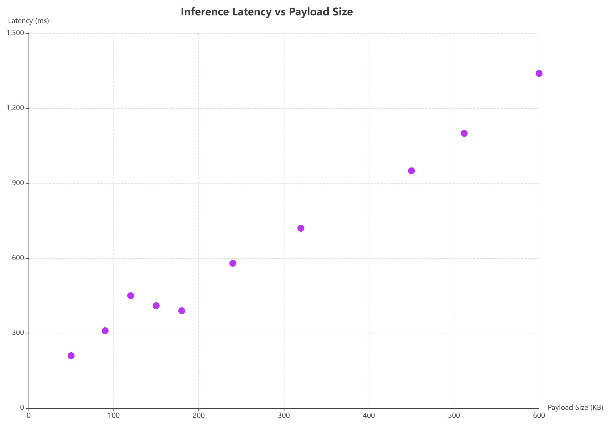
option = {
  title: { text: 'Inference Latency vs Payload Size', left: 'center' },
  tooltip: { trigger: 'item', formatter: function (p) { return 'Size: ' + p.value[0] + ' KB<br />Latency: ' + p.value[1] + ' ms'; } },
  xAxis: { name: 'Payload Size (KB)', type: 'value', splitLine: { lineStyle: { type: 'dashed' } } },
  yAxis: { name: 'Latency (ms)', type: 'value', splitLine: { lineStyle: { type: 'dashed' } } },
  series: [{
    type: 'scatter',
    symbolSize: 12,
    data: [
      [120, 450], [240, 580], [50, 210], [512, 1100], [320, 720],
      [180, 390], [450, 950], [90, 310], [600, 1340], [150, 410]
    ],
    itemStyle: { color: '#aa00ff' }
  }]
};
7. Sunburst Chart (Multi-Level Codebase Licensing)
Visualize hierarchical relationships with concentric rings. Our platform acts as an organic chart maker to simplify complex nested data configurations.
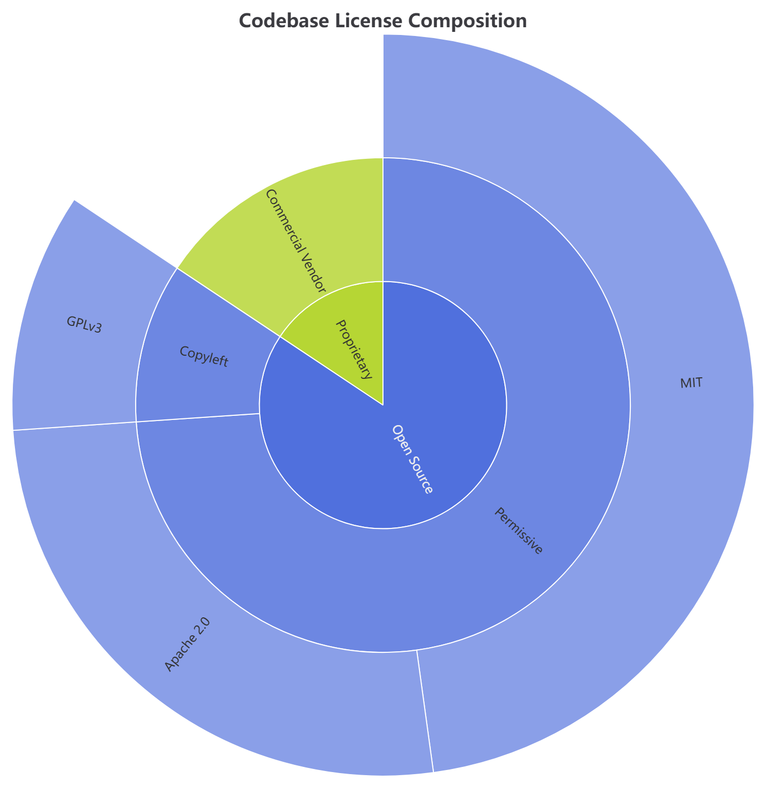
option = {
  title: { text: 'Codebase License Composition', left: 'center' },
  series: [{
    type: 'sunburst',
    radius: [0, '90%'],
    data: [{
      name: 'Open Source',
      children: [
        { name: 'Permissive', children: [{ name: 'MIT', value: 55 }, { name: 'Apache 2.0', value: 30 }] },
        { name: 'Copyleft', children: [{ name: 'GPLv3', value: 12 }] }
      ]
    }, {
      name: 'Proprietary',
      children: [{ name: 'Commercial Vendor', value: 18 }]
    }]
  }]
};
8. Sankey Diagram (Infrastructure Cost Flow Analyzer)
Trace operational resource mapping or financial variables across computational steps with flowing node weight links.
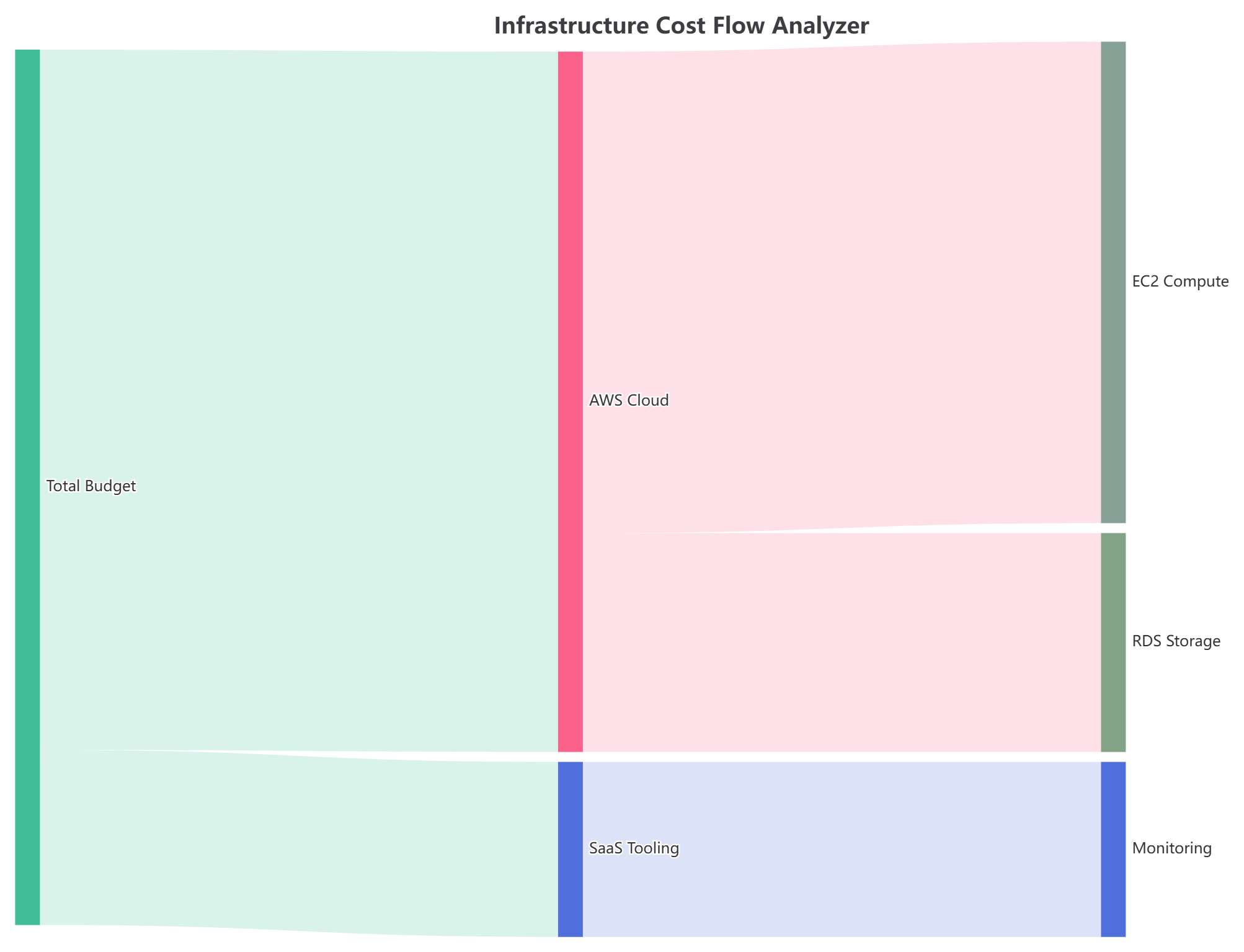
option = {
  title: { text: 'Infrastructure Cost Flow Analyzer' },
  tooltip: { trigger: 'item', triggerOn: 'mousemove' },
  series: [{
    type: 'sankey',
    data: [
      { name: 'Total Budget' }, { name: 'AWS Cloud' }, { name: 'SaaS Tooling' },
      { name: 'EC2 Compute' }, { name: 'RDS Storage' }, { name: 'Monitoring' }
    ],
    links: [
      { source: 'Total Budget', target: 'AWS Cloud', value: 8000 },
      { source: 'Total Budget', target: 'SaaS Tooling', value: 2000 },
      { source: 'AWS Cloud', target: 'EC2 Compute', value: 5500 },
      { source: 'AWS Cloud', target: 'RDS Storage', value: 2500 },
      { source: 'SaaS Tooling', target: 'Monitoring', value: 2000 }
    ],
    lineStyle: { color: 'source', curveness: 0.5 }
  }]
};
9. Heatmap (Hourly Deployment Velocity Grid)
Monitor systemic densities, deployment volumes, or continuous traffic shifts across custom timeframe matrices easily.
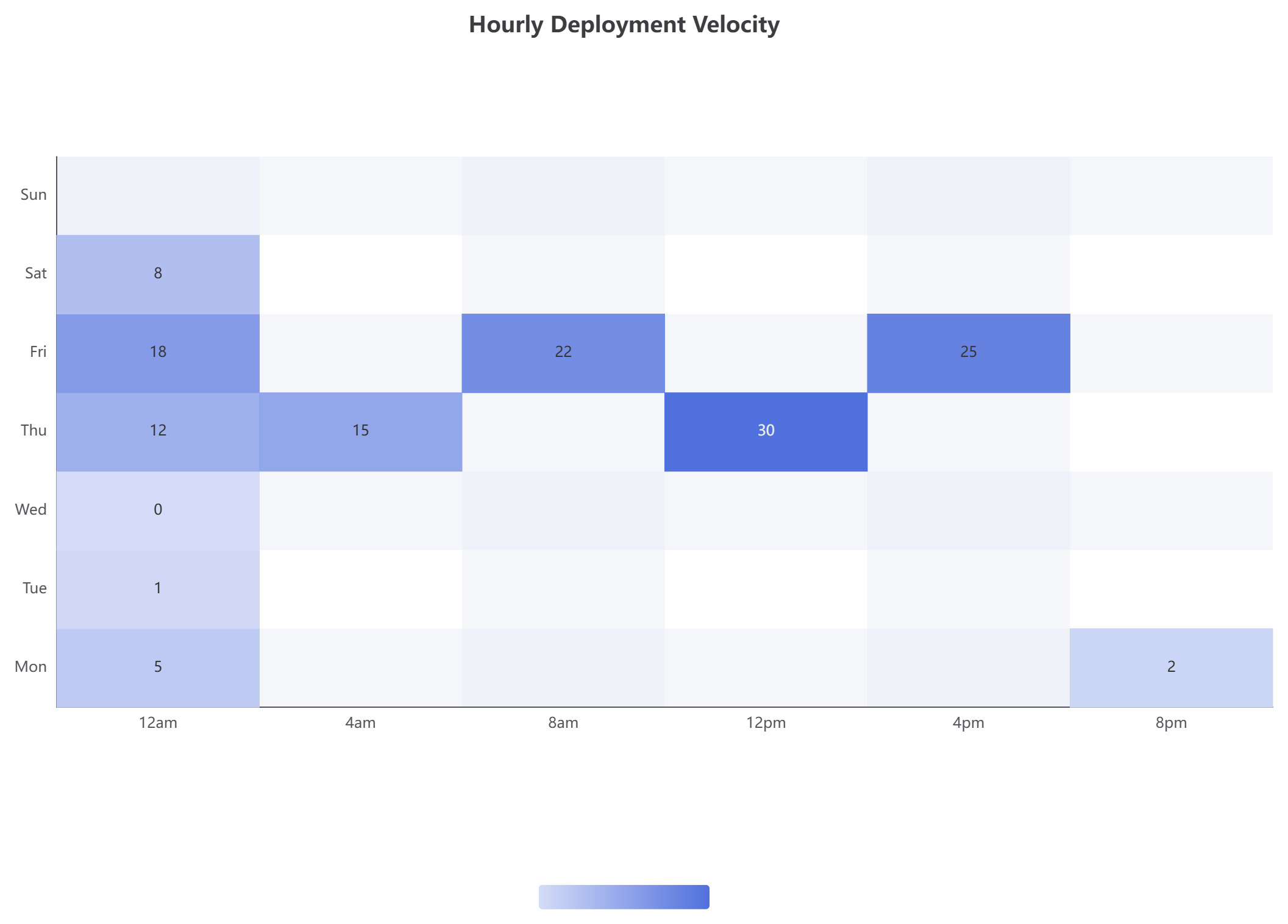
option = {
  title: { text: 'Hourly Deployment Velocity', left: 'center' },
  tooltip: { position: 'top' },
  grid: { height: '50%', top: '15%' },
  xAxis: { type: 'category', data: ['12am', '4am', '8am', '12pm', '4pm', '8pm'], splitArea: { show: true } },
  yAxis: { type: 'category', data: ['Mon', 'Tue', 'Wed', 'Thu', 'Fri', 'Sat', 'Sun'], splitArea: { show: true } },
  visualMap: { min: 0, max: 30, type: 'continuous', orient: 'horizontal', left: 'center', bottom: '15%' },
  series: [{
    name: 'Deployments',
    type: 'heatmap',
    data: [[0,0,5],[0,1,1],[0,2,0],[0,3,12],[0,4,18],[0,5,8],[1,3,15],[2,4,22],[3,3,30],[4,4,25],[5,0,2],[6,0,1]],
    label: { show: true },
    emphasis: { itemStyle: { shadowBlur: 10, shadowColor: 'rgba(0, 0, 0, 0.5)' } }
  }]
};
Part 3: Enhance Your Workflow – ECharts Auto-Formatting Now Live in VPasCode!
At Visual Paradigm, we are constantly looking for ways to make your visual creation experience smoother, faster, and more intuitive. Today, we are excited to introduce Code Formatting for ECharts in VPasCode—a feature designed directly with your usability in mind.
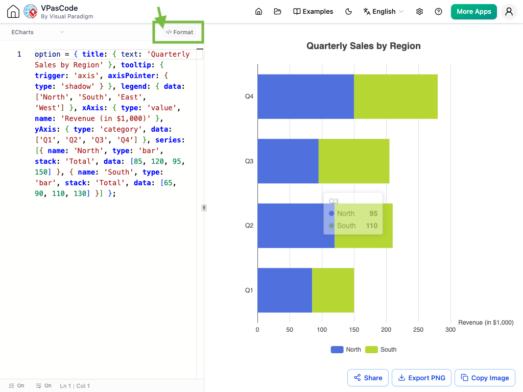
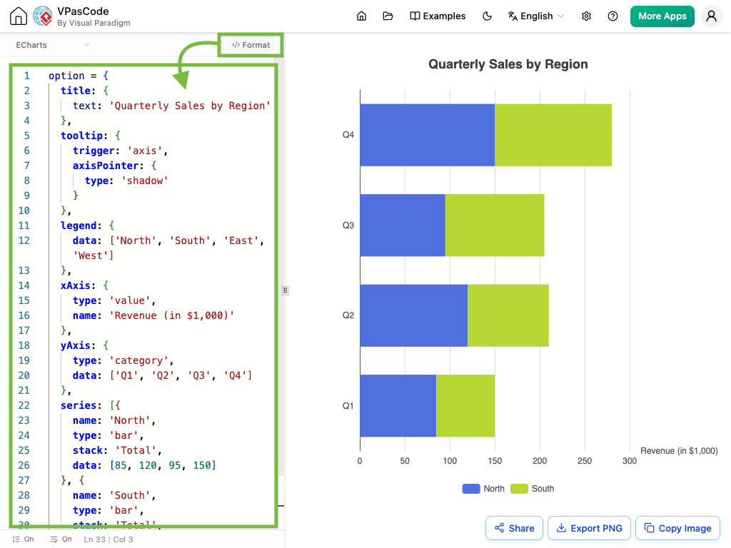
When working with complex chart scripts, readability is everything. Squeezing multiple attributes onto a single line makes it easy to miss details or make editing mistakes. With our new formatting tool, your code structure is transformed instantly:
- Nothing Hidden: Every attribute is clearly listed on its own line, giving you total visibility over your chart’s structure.
- Effortless Editing: Quickly locate and update labels, series data, or styling rules without hunting through packed lines of code.
- One-Click Cleanup: Simply click the
</> Formatbutton at the top of the editor to instantly organize your script into clean, standard indentations.
Before Formatting
After Formatting
Try It Yourself!
See how much easier formatted code is to work with. Open squeezed code in the editor, then hit </> Format to clean it up in one click.
Conclusion
Stop settling for rigid, uneditable AI images or wrestling with cluttered, hard-to-read code. Visual Paradigm provides the ultimate solution for modern data visualization: a flexible AI chart maker that adapts to your actual business needs, paired with a powerful, code-driven editor.
Bring your ideas to life instantly with AI Chatbot chart generation, and freely edit the data and style using VPasCode’s newly enhanced ECharts support and auto-formatting tools. Whether you need to translate raw business metrics or build a centralized canvas for structural engineering maps, this unified ecosystem streamlines your daily workflows and elevates your presentations.
Launch the Live VPasCode Editor Now →
References
- AI Chart Generator Chatbot: Instantly generate diverse chart types using natural language prompts.
- VPasCode Text-to-Diagram Platform: A unified environment for rendering diagrams and charts via code.
- Diagram-as-Code Tool: Visual Paradigm’s feature for precise, code-driven diagram creation.
Related posts:
 AI State Machine Diagram Case Study for Microwave Lifecycle
Comprehensive Step-by-Step Guide: Creating a 3D Printer UML State Machine Diagram Using Visual Paradigm AI Chatbot
AI State Machine Diagram Case Study for Microwave Lifecycle
Comprehensive Step-by-Step Guide: Creating a 3D Printer UML State Machine Diagram Using Visual Paradigm AI Chatbot
 Best AI-Powered Visual Modeling Software in 2026: Why Visual Paradigm Leads the Way
 Fast-Track Use Case Diagrams with Visual Paradigm AI Chatbot