


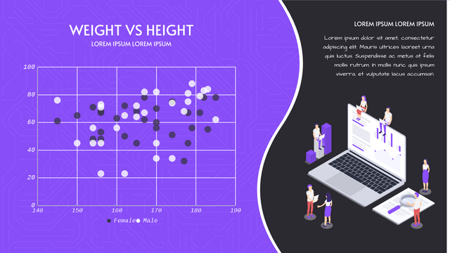
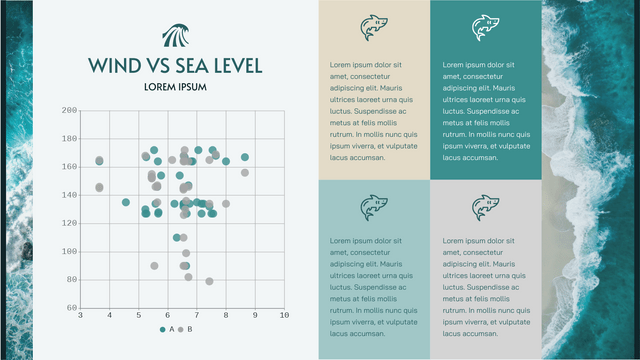
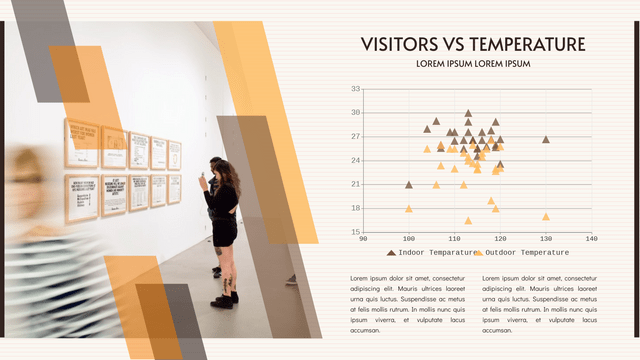
A Scatter Plot (also known as a scatter Chart, and Correlation Plot) is a tool for analyzing the relationship between two variables, used to determine the degree of correlation between two variables.
One variable is plotted on the horizontal axis and the other on the vertical axis. The pattern of their intersection points graphically displays the relational pattern. It is one of the Seven Basic Tools of Quality.
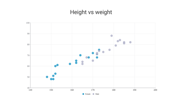
Code Variables
If the point is coded (color / shape / size), an additional variable can be displayed. The data is displayed as a collection of points. For each point, the value of one variable determines the position on the horizontal axis and the value of another variable determines the position on the vertical axis.
The most common is that scatter charts are used to prove or refute causality. Although the graph shows the relationship, it does not prove that one variable leads to another. Therefore, we can use the scatter diagram to examine the theory of causality and find the root cause of the identified problem.
For example, we can analyze the patterns of motorcycle accidents on highways. You choose two variables: motorcycle speed and the number of accidents, and draw a chart. Once the chart is completed, you will notice that the number of accidents increases as the vehicle speed increases. This shows that there is a certain relationship between the speed and the occurrence of traffic accidents on the expressway.
When should scatter plots be used
The main use of scatter plots is to observe and display the relationship between two numerical variables. We want to see how well we can predict the vertical value if we get a particular horizontal value.
You will often see variables on the horizontal axis represented as independent variables and variables on the vertical axis as dependent variables. The identification of correlations between variables can be described as positive or negative, strong or weak, linear or nonlinear.
Scatter plot correlation pattern
The degree of correlation between variables depends on how scattered the points are on the graph. The more points you plot on a graph, the less correlated the variables are. The closer the points are drawn to a straight line, the higher the correlation. The correlation degree is denoted by “R”.
The following scatter plot types shown in the table illustrate the degree of correlation between variable X and variable Y.
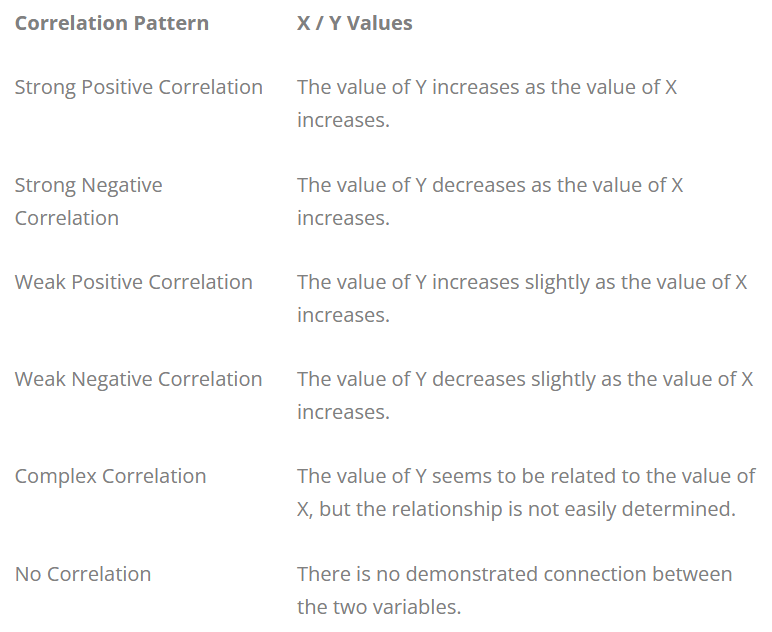
Strong Positive Correlation
Strong Negative Correlation
Weak Positive Correlation
Complex Correlation
No Correlation
Scatter Chart Example: Arm Length on Grade 11
The scatter graph shows information about the height and the arm length of each of 8 students in Year 11. If we see the correlation between the student’s height and arm length exhibit a trend, we can estimate the arm length of a student with a certain value of height given and vice-versa. The chart above shows there is a positive correlation between arm length and height.
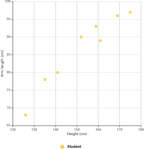
After determining the correlation between the variables, you can then predict the behavior of the dependent variable based on the measure of the independent variable. This chart is very useful when one variable is easy to measure and the other is not. For example, a student in Year 11 has a height of 148 cm, we can estimate the arm length of this student is around 84 cm.
How to create and publish your Scatter Chart Online
Using the Visual Paradigm online spreadsheet editor, you can quickly and easily visualize data and statistics. It’s very easy to use and works 99.9% of the time like you would with Microsoft Excel.
Visual Paradigm Online makes it easy to enter information and turn it into amazing scatter diagrams. You can create charts online by starting your design from a pre-made scatter chart template. Do this by adding your own data to the chart, adjusting colors and other Settings to match your brand or theme.
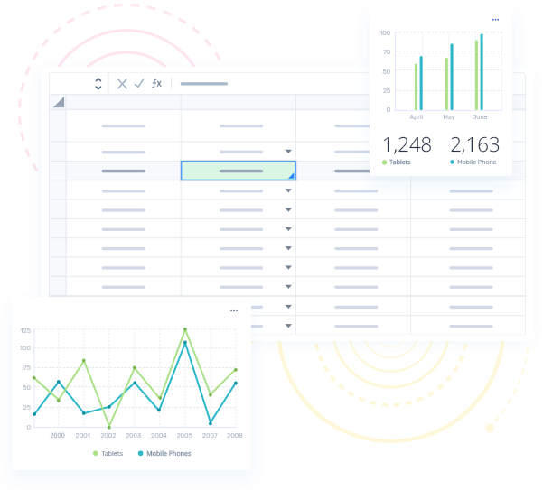
Beautiful Scatter Chart Templates


This post is also available in Deutsch, Español, فارسی, Français, English, Bahasa Indonesia, 日本語, Polski, Portuguese, Ру́сский, Việt Nam, 简体中文 and 繁體中文.