


Understanding the AI-Powered KPI Performance Diagram for a Coffee Shop
This article breaks down the provided screenshot of a KPI Performance Diagram from Visual Paradigm’s AI-Powered KPI Performance Diagram Builder. The diagram visualizes strategic elements for a “Coffee Shop” business, mapping initiatives to metrics and KPIs with cause-and-effect connections. Using the structure of What, Why, When, Who, and How, we explore its components, purpose, applications, users, and interpretation to provide a comprehensive overview.
What: Defining the Diagram and Its Components
The KPI Performance Diagram is a visual strategy map generated by an AI-powered web tool from Visual Paradigm. It transforms abstract business strategies into an interactive, flow-based diagram that illustrates cause-and-effect relationships between key elements. In this specific screenshot, the diagram is titled “Coffee Shop” and depicts performance tracking for a coffee shop operation.
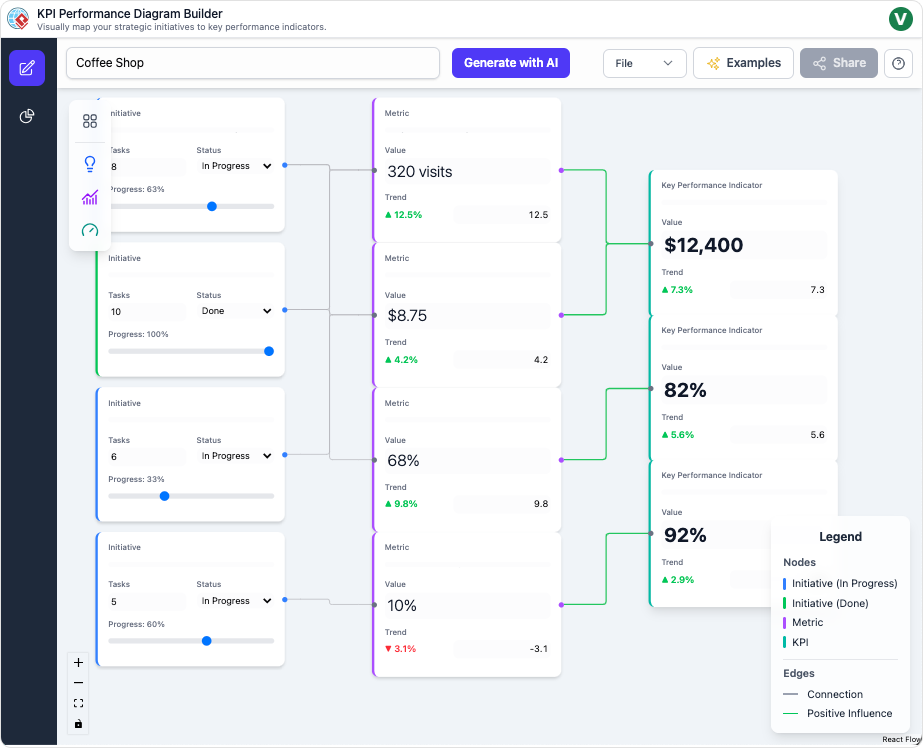
Key visual and structural elements include:
- Layout: A three-column flow from left to right, resembling a strategy map (e.g., similar to Balanced Scorecard frameworks). Initiatives on the left feed into Metrics in the middle, which drive KPIs on the right.
- Nodes (Boxes):
- Initiatives (left column, blue or green borders): Represent strategic actions or projects. Each includes:
- Task count (e.g., “8 Tasks”).
- Status (e.g., “In Progress” or “Done”).
- Progress bar (e.g., 83% with a blue slider).
- Examples in the diagram:
- Top: 8 Tasks, In Progress, 83%.
- Second: 10 Tasks, Done, 100% (green border for completion).
- Third: 6 Tasks, In Progress, 33%.
- Bottom: 5 Tasks, In Progress, 60%.
- Metrics (middle column, purple borders): Quantifiable measures tracking operational performance. Each shows:
- Value (e.g., “320 visits”).
- Trend indicator (e.g., ▲12.5% in green for positive, or ▼ -3.1% in red for negative).
- A numerical rating (e.g., 12.8).
- Examples:
- 320 visits, ▲12.5%, 12.8.
- $8.75 (possibly average order value), ▲4.2%, 4.2.
- 68% (e.g., occupancy rate), ▲9.8%, 9.8.
- 10% (e.g., discount rate or waste percentage), ▼ -3.1%, -3.1 (the only declining metric).
- KPIs (Key Performance Indicators) (right column, dark purple borders): High-level success metrics. Each includes:
- Value (e.g., “$12,400”).
- Trend (e.g., ▲7.3%).
- Examples:
- $12,400 (likely total revenue), ▲7.3%.
- 82% (e.g., customer satisfaction), ▲5.6%.
- 92% (e.g., retention rate), ▲2.9%.
- Initiatives (left column, blue or green borders): Represent strategic actions or projects. Each includes:
- Connections (Edges): Green lines with arrows indicating positive influence, showing how initiatives impact metrics, which in turn affect KPIs.
- Legend (bottom right): Explains colors and symbols—blue for in-progress initiatives, green for done, purple for metrics/KPIs, and green edges for positive influence.
- UI Elements: Top navigation includes “Generate with AI,” File menu, Examples, and Share. Left sidebar has tools for adding/editing. The canvas is light blue with auto-layout features.
This diagram is not static; it’s editable via drag-and-drop in the tool, with AI capabilities for generation and suggestions.
Why: The Purpose and Benefits of Using This Diagram
The primary purpose of this KPI Performance Diagram is to clarify complex business strategies by visualizing interdependencies, making it easier to understand how tactical actions lead to measurable outcomes. It addresses common challenges in business planning, such as siloed data in spreadsheets, by providing a dynamic, at-a-glance overview.
Benefits include:
- Clarity on Cause-and-Effect: It reveals how initiatives (e.g., a marketing push) drive metrics (e.g., increased visits) and ultimately KPIs (e.g., revenue growth), helping identify what works and what doesn’t.
- Performance Insights: Trends and ratings highlight strengths (e.g., rising visits) and weaknesses (e.g., the declining 10% metric), enabling proactive decision-making.
- AI-Enhanced Efficiency: The tool automates diagram creation, suggestions, and analysis, reducing manual effort and uncovering hidden insights like bottlenecks or risks.
- Collaboration and Reporting: Easy sharing via links or exports (PNG/JSON) facilitates stakeholder alignment, turning data into actionable stories.
- Strategic Alignment: In a coffee shop context, it ensures operational efforts (e.g., staff training) align with goals like profitability, preventing misallocation of resources.
Overall, it promotes data-driven culture, accelerates planning, and boosts performance by making abstract strategies tangible and interactive.
When: Scenarios and Timing for Application
This diagram is ideal for scenarios where visual mapping can simplify strategy execution and monitoring. Use it when:
- Strategic Planning Phases: During annual planning or quarterly reviews to map new initiatives and forecast impacts.
- Performance Reviews: When analyzing monthly/quarterly data to spot trends, such as after a sales dip in a coffee shop to trace back to underperforming initiatives.
- Project Management Milestones: At project kickoffs or checkpoints to track progress (e.g., when an initiative reaches 60% completion).
- Crisis or Opportunity Response: In real-time events like a sudden drop in customer traffic (e.g., interpreting the red trend to act quickly).
- Reporting Cycles: Before executive meetings or audits to generate summaries, especially when data is scattered across tools.
- AI-Assisted Brainstorming: When starting from scratch in a new domain, like expanding a coffee shop chain, to auto-generate structures.
Avoid using it for purely operational tasks without strategic ties, as it’s optimized for high-level mapping rather than granular data entry. It’s most effective in dynamic environments where frequent updates are needed.
Who: Target Users and Stakeholders
This tool and its diagrams cater to professionals involved in business strategy, analysis, and execution. Key users include:
- Business Leaders and Executives: CEOs or owners (e.g., a coffee shop owner) who need high-level overviews to align teams and make informed decisions on resource allocation.
- Project Managers: Those overseeing initiatives, using the diagram to track progress, dependencies, and impacts on metrics like task completion rates.
- Data Analysts and Strategists: Experts who dive into insights for bottleneck detection, risk assessment, and recommendations, leveraging AI for deeper analysis.
- Team Members and Collaborators: Operational staff (e.g., coffee shop managers) for focused deep-dives on specific initiatives, or cross-functional teams for shared reviews.
- Consultants and Advisors: External experts helping businesses visualize strategies, especially in industries like retail or hospitality.
It’s accessible to non-technical users via the intuitive interface but powerful enough for data-savvy professionals. Stakeholders like investors or board members benefit from shared exports for quick comprehension.
How: Interpreting and Creating the Diagram
Interpretation Guide
To interpret this diagram:
- Trace Flows: Start from left (initiatives) and follow green arrows to see cascades—e.g., a completed initiative (100%) likely boosts the top metric (320 visits, +12.5%), contributing to revenue KPI ($12,400, +7.3%).
- Assess Trends: Green up-arrows indicate growth; the red down-arrow on the 10% metric signals a risk (e.g., increasing costs or complaints) that could undermine overall performance despite strong KPIs.
- Evaluate Progress: Initiatives at varying stages (33%-100%) show execution health—prioritize low-progress ones if they link to declining metrics.
- Holistic View: Positive influences dominate, suggesting the coffee shop is on an upward trajectory, but the negative trend warrants investigation (e.g., via AI insights for root causes).
- Contextualize: For a coffee shop, metrics might represent foot traffic, average spend, satisfaction, and waste; KPIs could be revenue, loyalty, and efficiency—aligning with goals like profitability.
Creation and Usage Guide
Using the Visual Paradigm tool:
- Generate: Enter “Coffee Shop” as the domain; AI creates the base structure.
- Edit: Drag nodes, add details (e.g., tasks/progress), draw connections.
- Enhance with AI: Select a node for suggestions (e.g., add “Loyalty Program” initiative).
- Analyze: Switch to Insights for reports (e.g., executive summary highlighting the declining metric).
- Share: Export or link for collaboration.
Tips: Group nodes thematically, use auto-layout, and toggle AI models (e.g., GPT for creative insights) for varied perspectives.
For inspiration, here are examples of similar KPI/strategy map diagrams:
This post is also available in Deutsch, Español, فارسی, Français, English, Bahasa Indonesia, 日本語, Polski, Portuguese, Ру́сский, Việt Nam, 简体中文 and 繁體中文.