
Introduction
Project managers and teams worldwide have long searched for the most effective visualization tools to keep their projects on track. In the realm of project scheduling and management, two tools consistently rise to the top: Gantt charts and PERT charts. Based on extensive user feedback and real-world implementation experiences, professionals have discovered that while both tools serve the fundamental purpose of task scheduling, controlling, and administering project tasks, they offer distinctly different approaches and benefits. This comprehensive review explores what actual users have experienced when implementing these visualization methodologies, examining their unique strengths, practical applications, and how modern AI-powered tools are transforming the way teams create and manage these critical project documents.

What is the Difference between Gantt and PERT Chart?
Users who have worked with both PERT and Gantt charts report that these visualization tools serve as essential instruments in project management workflows. According to project management professionals, both charts excel at task scheduling, controlling, and administering the tasks necessary for project completion. However, experienced users have noted a fundamental distinction in their structure: PERT charts function as network diagrams, while Gantt charts operate as bar charts. This structural difference has significant implications for how teams perceive and interact with their project timelines.
What is the PERT Chart?
Project managers who have implemented PERT (Program Evaluation and Review Technique) charts describe them as invaluable tools for scheduling, organizing, and coordinating complex task structures within projects. Users report that the PERT methodology particularly excels when analyzing the tasks involved in completing a given project, with special emphasis on understanding the time needed to complete each individual task. Teams have found that PERT charts help them identify the minimum time required to complete the total project, making it especially valuable for projects with tight deadlines and complex interdependencies.
Users appreciate how PERT charts visually map out task relationships and dependencies in a clear network structure.
What is a Gantt Chart?
According to user reviews and testimonials, Gantt charts have become the go-to visualization tool for project teams seeking a straightforward, horizontal bar chart representation of their project schedules. Practitioners describe Gantt charts as providing an intuitive visual view of tasks scheduled over time, offering graphical visualization that helps teams plan, coordinate, and track specific project elements effectively.
Users consistently report that Gantt charts excel at consolidating multiple tasks and timelines into a single, comprehensible page. Stakeholders who have adopted Gantt chart methodologies note that these tools allow all project participants to perceive the same schedule information simultaneously, establishing mutually understood expectations and enabling teams to conduct their efforts according to desired protocols. The visual timeline feature, which clearly displays the start and end of tasks, has been particularly praised by users for making task interrelationships transparent and highlighting dependencies where one task must await the completion of another before beginning.
Teams report that Gantt charts provide an immediately understandable view of project timelines and task durations.
PERT vs Gantt Chart: User Experiences
Based on feedback from project management professionals who have utilized both tools extensively, distinct usage patterns have emerged. Users describe PERT charts as network diagrams that employ boxes to represent individual tasks and arrows to present dependencies between those tasks. According to those who create these diagrams regularly, the boxes are typically laid out from left to right, though there is no fixed Y-axis with specific dates. Users note that the first box, or root, is centered vertically on the left side, with subsequent tasks drawable anywhere along the Y-axis. Teams have observed that arrows can point to the right, up, or down, but never to the left, maintaining the chronological flow of the project.
In contrast, users working with Gantt charts describe them as bar graphs where the X-axis contains dates and the Y-axis lists separate tasks. Practitioners report that on each line of the Y-axis, the chart depicts a bar positioned to extend from the task’s start date to its end date. Users appreciate that tasks are automatically listed in start-date order, providing an immediate chronological overview of the project timeline.
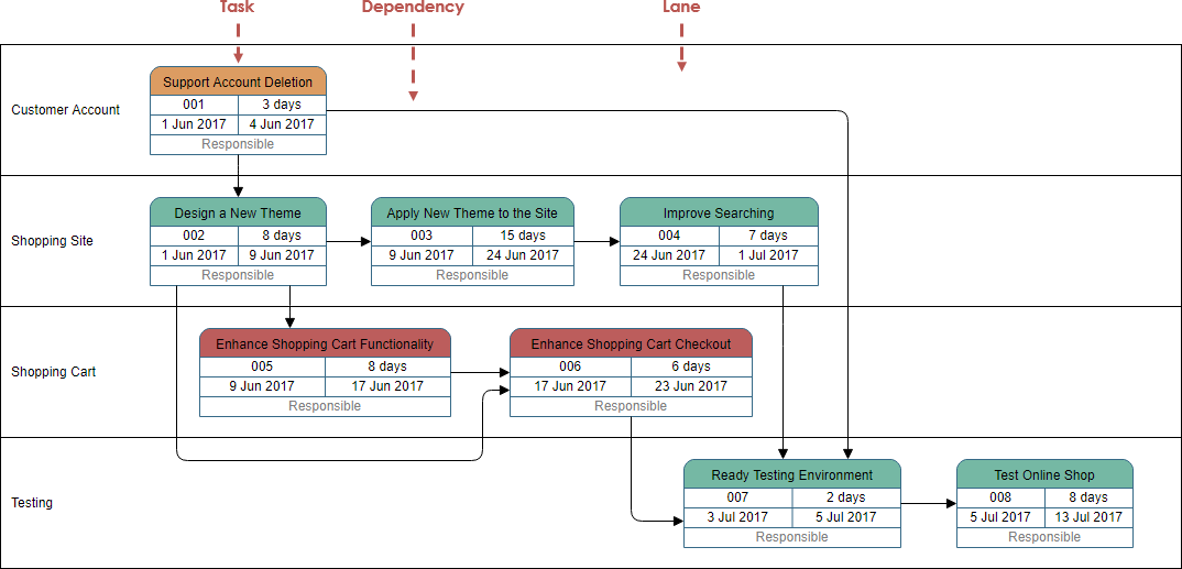
PERT vs Gantt Example: Real-World Comparisons
Project teams who have created both versions of the same project plan have shared valuable insights. Below is a PERT chart that users have created to visualize task dependencies:
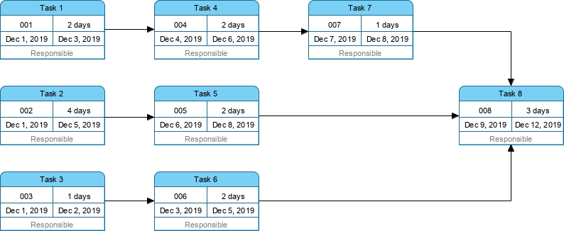
Users note that PERT charts excel at showing complex task relationships and critical paths.
The same project teams have also generated the “Gantt Chart version” of the above PERT chart:
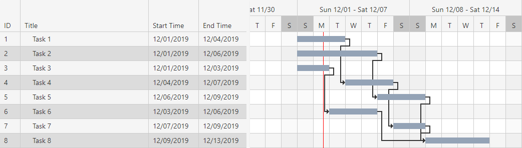
Teams report that Gantt charts provide clearer timeline visualization and are easier for stakeholders to understand at a glance.
Summary: What Users Have Learned
Based on extensive user feedback and comparative analysis, project managers have developed clear preferences based on their specific needs. Users report that because PERT charts clearly illustrate task dependencies, they are sometimes preferred over Gantt charts for certain project types. However, practitioners acknowledge that PERT charts can be harder to interpret, especially for large-scale projects with numerous tasks and complex relationships.
Most often, experienced project managers report using both techniques in order to serve multiple purposes, leveraging the strengths of each visualization method. On the contrary, users have noted that Gantt charts do not show clear dependencies or relationships between tasks as explicitly as PERT charts. Additionally, practitioners have observed that Gantt charts can fail to provide sufficient information for showing the critical path and detailed information for each activity.
Teams have summarized the key differences between the two approaches as follows:
| Gantt chart | PERT chart |
|---|---|
| Gantt chart is defined as the bar chart. | PERT chart is similar to a network diagram |
| Gantt chart was developed by Henry L. Gantt. | PERT chart was developed by the United States navy. |
| Gantt chart is often used for Small Projects | PERT chart can be used for large and complex Projects |
| Gantt chart focuses on the time required to complete a task | PERT chart focuses on the dependency of relationships. |
| Gantt chart is simpler and more straightforward | PERT chart could be sometimes confusing and complex but can be used for visualizing critical path |
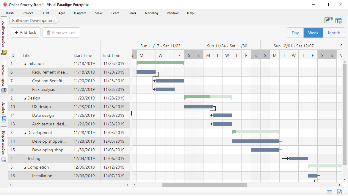
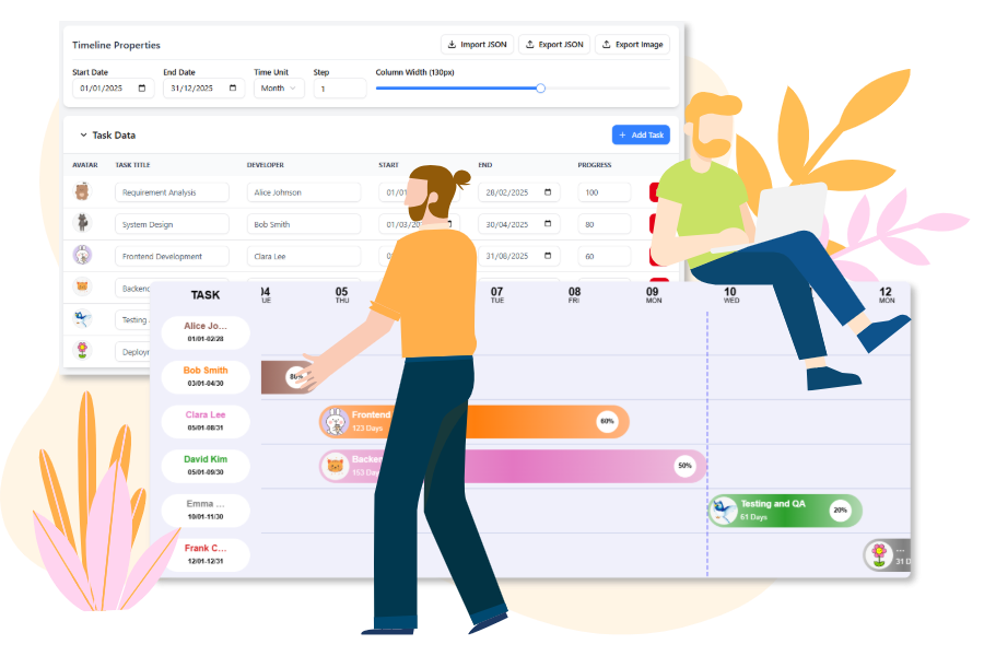
Instant Gantt Chart Builder: User Experiences
Project managers and developers who have adopted the free workspace for building Gantt charts report significant improvements in their workflow efficiency. Users describe the ability to build, customize, and generate production-ready Gantt Chart configuration code instantly as a game-changer for their project planning processes. Teams have particularly appreciated the streamlined interface that eliminates the traditional complexity associated with Gantt chart creation.
Users report that modern AI-powered tools have dramatically reduced the time required to create professional Gantt charts.
Core Features: Design, Configure, Generate
According to user testimonials, teams have successfully leveraged cutting-edge visualization technology through user-friendly frontends. Practitioners have highlighted several core features that have enhanced their project management capabilities:
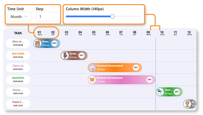
![]() Interactive Timeline: Users report being able to easily configure the Date Range, Time Unit (day, week, month), and Column Width using simple sliders and pickers. Teams appreciate the intuitive nature of these controls, which eliminate the need for complex manual adjustments.
Interactive Timeline: Users report being able to easily configure the Date Range, Time Unit (day, week, month), and Column Width using simple sliders and pickers. Teams appreciate the intuitive nature of these controls, which eliminate the need for complex manual adjustments.
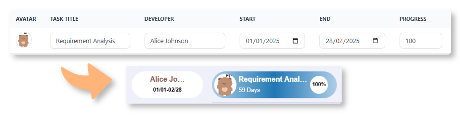
![]() Dynamic Task Editor: Project managers have found the ability to manage tasks by adding progress percentage, setting dates, and assigning developers with customizable avatars to be invaluable for maintaining accurate project records. Users report that this feature keeps team accountability high and project status transparent.
Dynamic Task Editor: Project managers have found the ability to manage tasks by adding progress percentage, setting dates, and assigning developers with customizable avatars to be invaluable for maintaining accurate project records. Users report that this feature keeps team accountability high and project status transparent.
![]() Live Preview: Teams consistently praise the ability to see changes instantly on the Gantt Chart, allowing them to view progress clearly in a visual way. Users note that this real-time feedback loop significantly improves decision-making and project adjustments.
Live Preview: Teams consistently praise the ability to see changes instantly on the Gantt Chart, allowing them to view progress clearly in a visual way. Users note that this real-time feedback loop significantly improves decision-making and project adjustments.
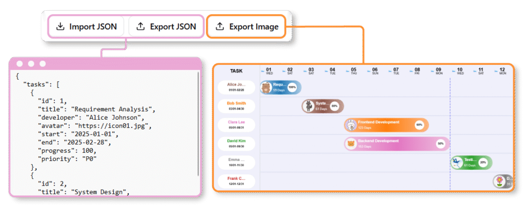
![]() Image Export: Practitioners have found the ability to export the Gantt Chart as an image essential for sharing their latest work with team members, stakeholders, and clients. Users report that this feature facilitates better communication and alignment across distributed teams.
Image Export: Practitioners have found the ability to export the Gantt Chart as an image essential for sharing their latest work with team members, stakeholders, and clients. Users report that this feature facilitates better communication and alignment across distributed teams.
How to Build Your Gantt Chart: User Workflows
Based on documented user experiences, teams have developed efficient workflows for creating comprehensive project plans using only visual interfaces:
01 | Input Tasks in the Data Table
Users report successfully entering each project task, including the Start Date, End Date, Assigned Team Member, and Progress (%), directly into spreadsheet-like data editors. Teams appreciate the familiar interface that resembles traditional spreadsheet applications, reducing the learning curve for new users.
Users find the data entry process intuitive and similar to working with familiar spreadsheet tools.
02 | Visualize & Customize the Timeline
Project managers have reported using control panels to adjust the overall project Date Range and change the time scale from Days to Weeks or Months. Teams consistently note their appreciation for seeing tasks instantly rendered as interactive bars on the chart, providing immediate visual feedback on their planning decisions.
03 | Review & Export
Users describe the review and confirmation process for final visual output as straightforward and efficient. Teams have successfully exported Gantt Charts to images and shared data via JSON with team members, facilitating collaboration and documentation.
Teams report that the export functionality makes it easy to share project status with stakeholders who may not have direct access to the planning tools.
How to Use Visual Paradigm’s AI-Powered Tools for Gantt Charts
According to user experiences, Visual Paradigm has provided several AI-driven methods to generate and manage Gantt charts instantly from text descriptions. Teams have reported significant time savings and improved accuracy when leveraging these AI capabilities:
AI Development Plan Generator: Users have successfully employed this tool to create instant visual timeline diagrams alongside textual plans. The workflow reported by practitioners includes:
-
Describe Your Project: Users enter a clear goal and constraints (e.g., “Plan a 3-month website redesign”) into the input field. Teams report that the more specific the description, the better the AI-generated output.
-
Generate: The AI analyzes the input to produce a detailed task breakdown and a corresponding visual timeline with Gantt-like elements. Users have been impressed by the accuracy and relevance of the AI-generated task sequences.
-
Refine: Practitioners manually adjust task durations, add dependencies, or modify the plan directly in the editor. Teams appreciate the flexibility to fine-tune AI suggestions to match their specific project requirements.
AI Chatbot (for PERT-to-Gantt Conversion): Users have reported success using the AI Chatbot to generate PERT charts by describing project phases. The ecosystem allows for seamless format conversion, where AI-generated PERT charts can be converted into Gantt views instantly. Teams note this capability as particularly valuable when different stakeholders prefer different visualization formats.
Standard AI Diagram Generator: In the Visual Paradigm Desktop (Enterprise Edition) or Online workspace, users have successfully employed the AI Diagram Generator to type what they need and receive accurate diagrams without manual drawing. Practitioners report that this feature has democratized professional diagram creation, making it accessible to team members without extensive training in project management visualization tools.
Key Benefits of AI Integration: User Testimonials
Based on comprehensive user feedback, several key benefits of AI integration in Gantt chart creation have emerged:
Automated Scheduling: Users report that AI successfully identifies task sequences and dependencies from plain English descriptions. Teams have noted that this capability eliminates the need for manual dependency mapping, reducing errors and saving considerable time.
Time Savings: Practitioners consistently report reducing project planning time from hours to minutes by skipping manual bar plotting. Users describe this time reduction as transformative, allowing them to focus more on strategic planning and less on administrative chart creation.
Dynamic Synchronization: Once generated, users have found that the Gantt Chart Builder ensures that any visual edits (like dragging a bar) are instantly reflected in the task data and vice-versa. Teams appreciate this bidirectional synchronization, which maintains data integrity and eliminates the confusion that can arise from mismatched visual and data representations.
Conclusion
The collective experiences of project managers, developers, and teams worldwide demonstrate that both Gantt and PERT charts offer unique value in project management workflows. Users have consistently reported that while Gantt charts excel in providing clear, straightforward timeline visualizations that stakeholders can quickly understand, PERT charts offer superior dependency mapping and critical path analysis for complex projects. The emergence of AI-powered tools has transformed the landscape, with practitioners reporting dramatic reductions in chart creation time and improved accuracy in task sequencing and dependency identification.
Teams who have adopted modern, AI-enhanced visualization platforms report that the ability to seamlessly convert between PERT and Gantt formats, combined with intuitive drag-and-drop interfaces and real-time synchronization, has fundamentally improved their project planning processes. Users emphasize that the choice between Gantt and PERT charts is not necessarily an either/or decision; rather, successful project managers leverage both tools strategically, using PERT charts for initial planning and dependency analysis, then converting to Gantt charts for ongoing progress tracking and stakeholder communication.
As AI technology continues to evolve, user experiences suggest that the barriers to creating professional-grade project visualizations will continue to decrease, making sophisticated project management accessible to teams of all sizes and expertise levels. The integration of natural language processing, automated scheduling, and dynamic synchronization has already demonstrated tangible benefits in time savings, accuracy improvements, and enhanced collaboration. For organizations seeking to improve their project management capabilities, the combination of traditional visualization methodologies with modern AI-powered tools represents a proven path to more efficient, transparent, and successful project delivery.
References
- Gantt Chart Software: Comprehensive guide to Gantt chart software tools and features for project management visualization.
- Practical Guide to Gantt Charts: Detailed practical guide covering Gantt chart implementation and best practices for project managers.
- Gantt Chart for Project Managers: Essential resource for project managers on utilizing Gantt charts effectively in project planning and execution.
- Comprehensive Tutorial: Using Visual Paradigm’s AI Development Plan Generator: Step-by-step tutorial on leveraging AI tools for automated development planning and timeline generation.
- AI Diagram Generation: Overview of AI-powered diagram generation capabilities that turn text descriptions into professional diagrams instantly.
- Comprehensive Tutorial: Using Visual Paradigm’s AI Development Plan Generator: In-depth guide on utilizing AI development planning tools for project management.
- Comprehensive Tutorial: Using Visual Paradigm’s AI Development Plan Generator: Detailed walkthrough of AI-powered project planning features and capabilities.
- Gantt Chart for Project Managers (Chinese): Chinese language resource for project managers on Gantt chart implementation and usage.
- Visual Paradigm AI PERT Chart Generator: Guide to using AI tools for generating PERT charts and project network diagrams.
- Free Gantt Chart Builder Release: Announcement and documentation of the free Gantt chart builder tool with instant configuration capabilities.
- Smarter Diagrams Powered by AI: The All-in-One Visual Paradigm Platform AI Ecosystem: Comprehensive guide to Visual Paradigm’s AI ecosystem for diagram creation and project management.
- Free Gantt Chart Builder Release: Documentation on the free Gantt chart builder release with features for instant chart generation and customization.