


Introduction: Why I Turned to PERT Charts (And Why You Might Too)
As someone who has managed dozens of cross-functional projects—from software launches to marketing campaigns—I’ve always struggled with one universal challenge: How do I visualize complex task dependencies without spending hours manually mapping everything out? Traditional Gantt charts helped, but they often missed the nuanced interdependencies that make or break project timelines. That’s when I discovered PERT charts, and more recently, Visual Paradigm’s AI-powered approach to creating them. This isn’t a sponsored post—just my genuine experience testing these tools over the past few months, and why I now consider them essential for any serious project planner.

What Is a PERT Chart? (From a Practitioner’s Perspective)
When I first encountered PERT (Program Evaluation and Review Technique), I’ll admit—I was skeptical. Another acronym? Another diagram type? But after using it on a recent product launch, I understood why the U.S. Navy developed this in 1957 for the Polaris submarine project.
What struck me most: PERT charts don’t just show what needs to be done—they reveal when things must happen relative to each other, and crucially, which tasks are “critical” (delay these, and your whole project slips). In my experience, this clarity transformed stakeholder conversations from “Why is this late?” to “Here’s exactly where we need to focus resources.”
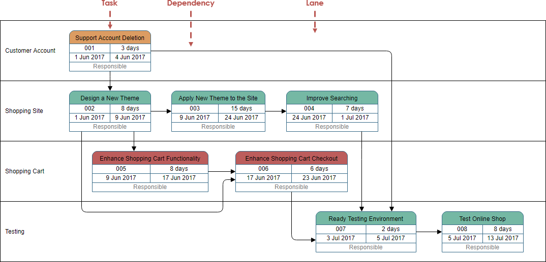
PERT Chart Notations: What Actually Matters When You’re Building One
Task Elements That Save Time
In Visual Paradigm, I appreciated that each task node includes four practical fields I actually use:
-
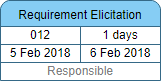
Task Name (obviously)
-
Task ID (for tracking in spreadsheets)
-
Duration (with three-point estimates—more on that later)
-
Start/End Dates (auto-calculated once dependencies are set)
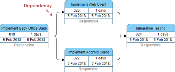
Dependencies: The Real Power Move
The dependency arrows aren’t just decorative. When I link Task B to Task A, the tool instantly understands: “B can’t start until A finishes.” This simple visual logic prevented me from accidentally scheduling parallel work that actually required sequential execution—a mistake I’ve made more times than I’d like to admit.
Enhanced Features I Didn’t Know I Needed
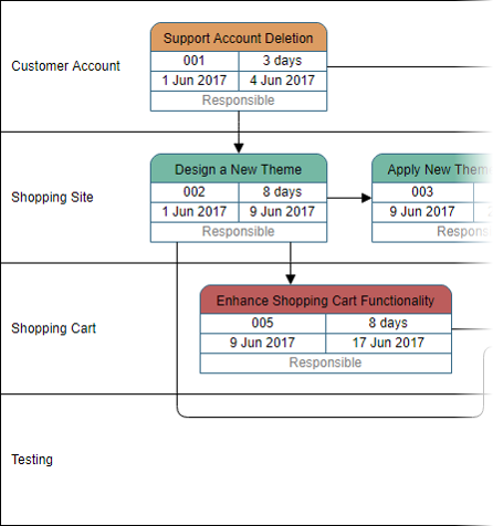
Swimlanes for Team Clarity
Adding lanes to my PERT chart was a game-changer for a recent multi-department initiative. I could visually separate “Engineering,” “Design,” and “QA” responsibilities without cluttering the dependency flow.
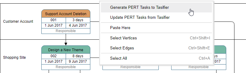
Tasifier Integration: From Diagram to Action
What impressed me most: assigning a task in the PERT chart automatically pushed it to Visual Paradigm’s Tasifier task manager. No more copying details between tools. When I updated a duration in the chart, the task manager reflected it instantly.
When I Actually Reach for a PERT Chart (Real-World Use Cases)
Based on my projects, PERT charts shine when you need to:
-
Plan realistic timelines – Especially when stakeholders demand “just a quick estimate”
-
Identify the critical path – I’ve saved weeks by focusing buffer time only on critical tasks
-
Spot parallelizable work – Found three tasks I could run concurrently on a website rebuild
-
Compress schedules strategically – When leadership asked “Can we launch two weeks early?”, I knew exactly which non-critical tasks to fast-track
-
Visualize slack time – Reduced team stress by showing which delays wouldn’t impact the final deadline
My Step-by-Step Process for Building a PERT Chart (The Manual Way)
Before AI entered the picture, here’s how I approached PERT planning:
-
List activities & milestones – I brainstorm with sticky notes first, then digitize
-
Sequence logically – What must come before what? I ask “If we skip this, does the project break?”
-
Draft the diagram – Start with major phases, then drill into details
-
Estimate durations – I use three-point estimates (optimistic/most likely/pessimistic) for accuracy
-
Calculate the critical path – The longest dependency chain determines minimum project duration
-
Update iteratively – My chart lives in a shared workspace; we adjust as realities change
Real PERT Chart Examples That Inspired My Workflow
Project Preparation Example
This example mirrored my systems analysis work perfectly—showing how data gathering and proposal phases interlock.

Software Development Template
I adapted this SDLC template for a recent app launch. Having analysis → design → build → test phases in lanes kept our agile sprints aligned with overall timeline goals.

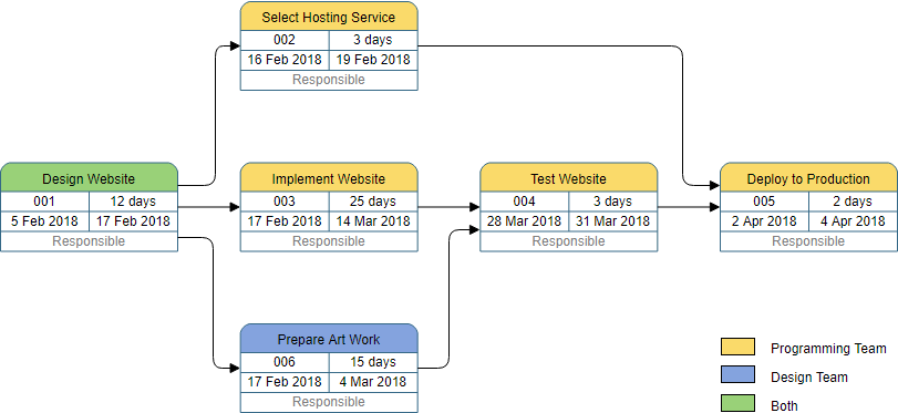
Website Creation Example
When building a client site, this visual breakdown of hosting selection, design, HTML coding, and artwork helped me coordinate freelancers who’d never worked together before.
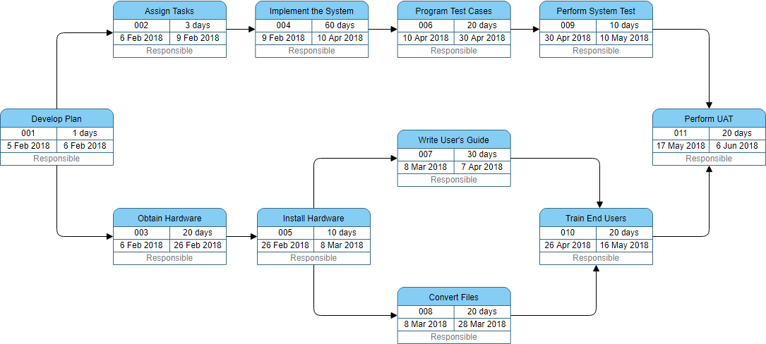
Tasks with Milestones Template
Milestones are psychological anchors for teams. This example showed me how to mark key decision points without cluttering task flows.

Project Management Example
For executive updates, I simplify my PERT chart to this high-level view—focusing on phase completions rather than individual tasks.
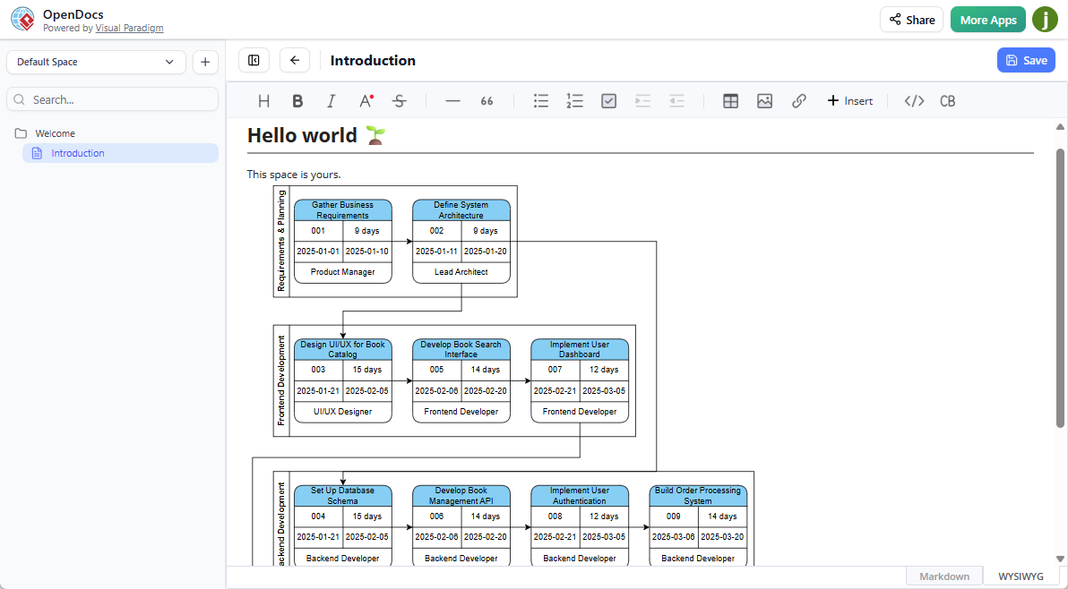
The Game-Changer: AI-Powered PERT Chart Creation in OpenDocs
Why I Was Skeptical (And Why I Was Wrong)
When Visual Paradigm announced AI-generated PERT charts in February 2026, I assumed it would produce generic, unusable diagrams. I was pleasantly surprised.
My First AI-Generated PERT Chart: A Walkthrough
Here’s exactly how I created my first AI-assisted chart:
-
Insert > Diagrams > PERT Chart in OpenDocs

-
Select PERT Chart from the diagram library
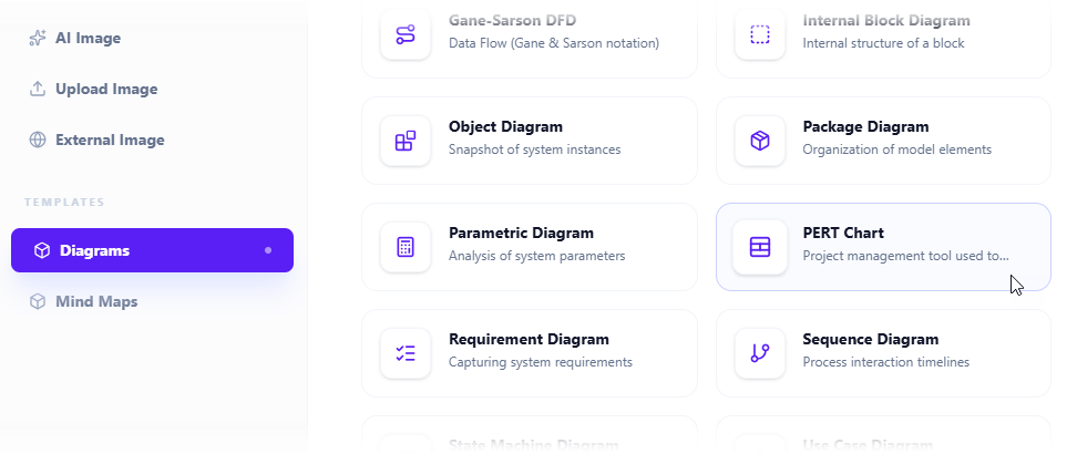
-
Click “Create with AI” (top-right corner)

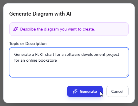
-
Describe my project naturally: “Generate a PERT chart for launching a mobile banking app with user registration, transaction processing, and security verification phases over 4 months”
-
Review the AI output – Within seconds, I had a structured network diagram with logical dependencies
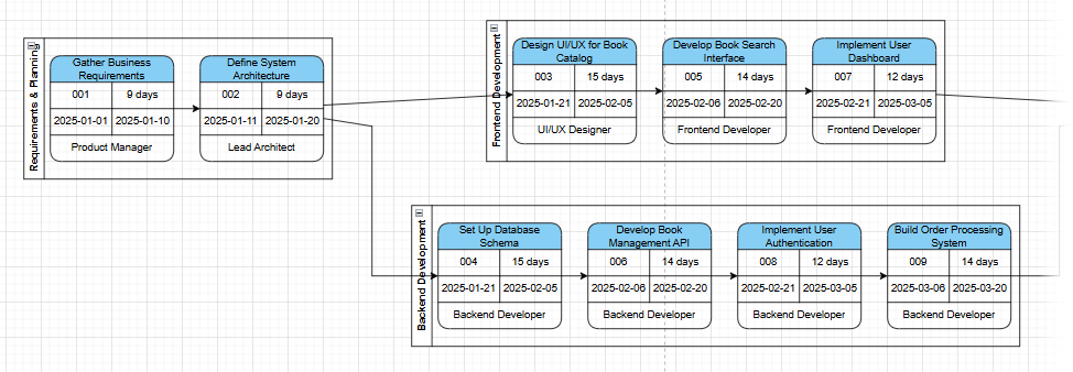
-
Refine manually – I adjusted durations, added a compliance review task the AI missed, and tweaked the layout
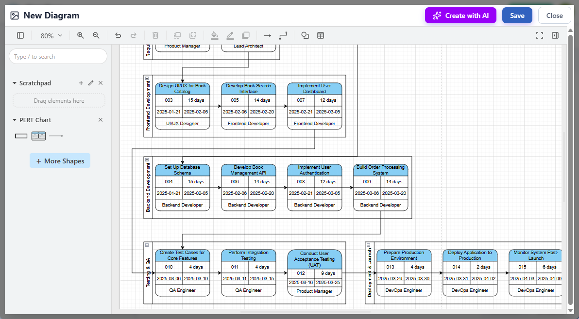
-
Save and embed – The final chart lived directly in my project documentation
AI Capabilities That Actually Save Me Time
Automated Calculations I Used to Do Manually
The AI performs forward/backward passes to calculate earliest/latest start times. I verified its math on three projects—it was consistently accurate, saving me 30-45 minutes per chart.
Critical Path Highlighting
Instead of manually tracing the longest path, the AI highlights it in red. On my last project, this immediately showed me that “security audit” was the bottleneck—not the feature development I’d been worried about.
Three-Point Estimate Support
When I included “optimistic: 2 weeks, most likely: 3 weeks, pessimistic: 5 weeks” in my prompt, the AI calculated expected durations using the PERT formula (O+4M+P)/6. This statistical rigor impressed my risk-averse stakeholders.
Dynamic Recalculation
When I manually extended a task duration during a team meeting, the entire schedule and critical path updated in real-time. No more “Let me recalculate this tonight and send an update.”
Where I Use AI-Generated PERT Charts Now
-
Initial project scoping: Get a first-draft timeline in minutes, not hours
-
Stakeholder alignment: Visualize dependencies for non-technical leaders
-
Risk workshops: Use the critical path to facilitate “what-if” discussions
-
Documentation: Embed live, editable charts directly in project wikis
-
Team onboarding: New members grasp project flow faster with a visual map
Conclusion: Should You Adopt AI-Powered PERT Charts?
After three months of regular use, my verdict is clear: Yes—with caveats.
The AI generator isn’t magic—it won’t replace your project expertise. But it does eliminate the tedious setup work that often delays planning. I now spend 80% less time building the initial chart and 100% more time refining strategy with my team.
If you manage complex projects with interdependent tasks, start with Visual Paradigm’s free trial. Try generating one chart with AI, then manually adjust it. You’ll quickly see whether the time savings justify the learning curve. For me, it transformed PERT charts from a “nice-to-have” documentation exercise into a living, collaborative planning tool that actually moves projects forward.
One final tip: Always review the AI’s dependency logic. I caught two instances where it assumed parallel execution for tasks that actually required sequential approval. The AI is a powerful assistant—not a replacement for your judgment.
References
A Complete Comprehensive Guide to Visual Paradigm’s AI-Powered PERT Chart Generator: In-depth walkthrough of Visual Paradigm’s AI PERT capabilities, including prompt engineering tips and real-world implementation strategies.
Create PERT Charts in Seconds with AI: Official Visual Paradigm article demonstrating rapid AI-generated PERT chart creation with practical examples and use cases.
Enhanced PERT Chart Features: Detailed overview of Visual Paradigm’s advanced PERT functionality including swimlanes, Tasifier integration, and collaborative editing tools.
Enhanced PERT Chart Features: Comprehensive documentation of Visual Paradigm’s PERT chart enhancements for enterprise project management workflows.
Visual Paradigm UML Diagram Generator with AI Support: Chinese-language technical article covering Visual Paradigm’s AI diagram generation capabilities across multiple diagram types including PERT charts, with focus on relationship inference and rule standardization.
AI PERT Chart Generator Now Available in OpenDocs: Official release announcement detailing the integration of AI-powered PERT chart creation into Visual Paradigm’s OpenDocs knowledge management platform.
AI Diagram Generator Release Notes: Broader announcement covering Visual Paradigm’s AI diagram generation features across multiple chart types, with technical specifications and edition requirements.
Create PERT Charts in Seconds with AI: Practical guide showing step-by-step AI PERT chart creation with natural language prompts and refinement techniques.
A Complete Comprehensive Guide to Visual Paradigm’s AI-Powered PERT Chart Generator: Expert review covering prompt optimization, critical path validation, and integration strategies for Visual Paradigm’s AI PERT tools.
This post is also available in Deutsch, Español, فارسی, Français, English, Bahasa Indonesia, 日本語, Polski, Portuguese, Ру́сский, Việt Nam, 简体中文 and 繁體中文.