


The strategic alignment of operational tasks with high-level business objectives represents a perennial challenge for modern organizational leadership. Imagine a scenario where a manager of a subscription box service struggles to articulate how a new loyalty program directly influences monthly recurring revenue. This individual possesses the data and the vision, yet lacks a cohesive visual framework to demonstrate the causal relationships between these disparate elements. This is where the AI-powered KPI performance diagram builder serves as a sophisticated catalyst for clarity, transforming abstract strategies into tangible, interconnected maps of success. By leveraging an intelligent, node-based interface, professionals can finally bridge the gap between daily initiatives and the critical metrics that define organizational health.
Upon initial engagement with the interface, the user is presented with a precise and information-dense environment tailored for high-level planning. As observed in the first visual reference, the application has generated a comprehensive performance framework specifically designed for “Improving Customer Retention for a Subscription Box.” The diagram utilizes a logical progression from left to right, beginning with Initiatives such as “Launch Loyalty Program” and “Personalized Email Campaigns.” These nodes are not merely static labels; they contain technical details including task counts, progress percentages, and status indicators. For instance, the “Launch Loyalty Program” initiative is depicted at ninety percent completion, with six tasks currently in progress. These tactical efforts flow into Metrics like “Customer Churn Rate” and “Customer Lifetime Value,” which in turn influence the overarching Key Performance Indicators: “Monthly Recurring Revenue” and “Customer Retention Rate.”

Key Takeaways for Strategic Performance Mapping
-
Strategic Alignment: Establishes a definitive visual connection between operational initiatives and high-level KPIs, ensuring every task serves a broader purpose.
-
AI-Driven Efficiency: Utilizes advanced artificial intelligence to generate foundational diagram structures, significantly reducing the time required for framework design.
-
Dynamic Data Visualization: Employs a React Flow-powered canvas to display real-time statuses, values, and trends for metrics and initiatives.
-
Actionable Intelligence: Transforms visual data into comprehensive reports, including risk assessments and executive summaries, through the AI Insights engine.
-
Enhanced Collaboration: Facilitates seamless communication with stakeholders via shareable, read-only interactive links and high-resolution image exports.
The AI-powered KPI performance diagram builder effectively eliminates the “blank canvas” paralysis that often stymies strategic planning sessions. By entering a simple domain description, the internal AI engine analyzes the industry context and proposes a relevant ecosystem of metrics and drivers. In the provided example regarding subscription box retention, the system correctly identified that “Net Promoter Score” and “Customer Churn Rate” are the primary levers for driving “Monthly Recurring Revenue.” The visual language of the diagram is further enhanced by a sophisticated legend; blue borders signify initiatives currently in progress, while green borders indicate completed efforts. Arrows, or edges, represent the flow of influence, with green edges specifically highlighting a positive influence on the subsequent node, thereby providing an immediate visual grasp of the performance trajectory.
Seamless Stakeholder Communication and Cloud Integration
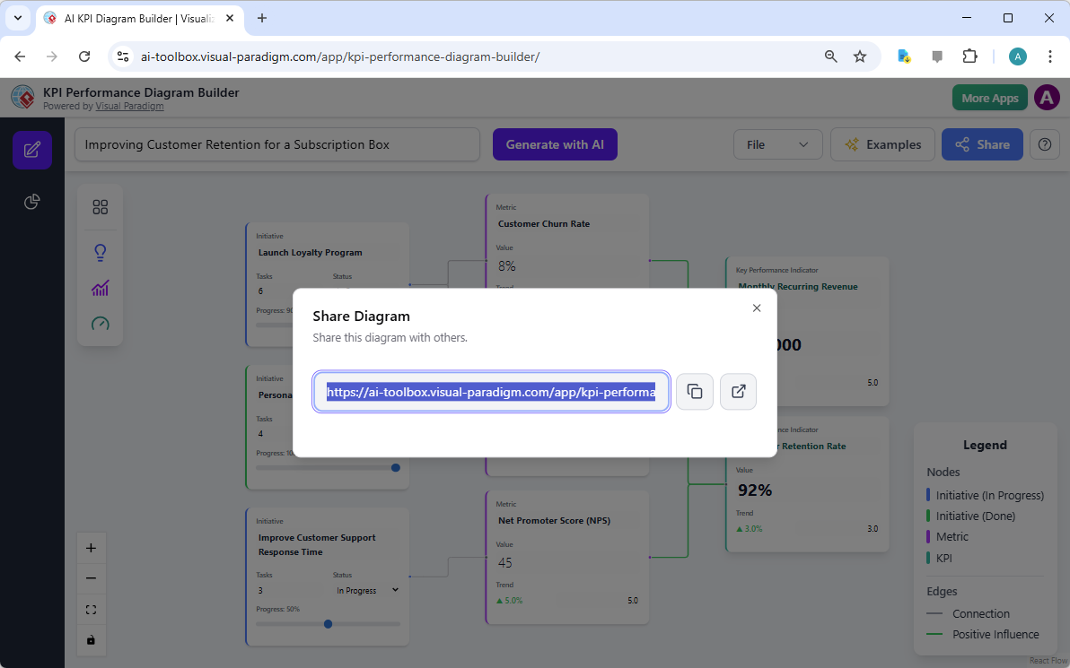
Transparency is a cornerstone of effective performance management, and this professional tool prioritizes the dissemination of strategic insights across the organization. Once a performance framework has been refined and the data points—such as the eighty-thousand-dollar Monthly Recurring Revenue or the ninety-two percent Customer Retention Rate—have been validated, the necessity for secure sharing becomes paramount. The application provides a robust cloud-based management system that allows users to save their progress and access it from any geographical location. This ensures that the strategic map remains a living document, capable of evolving alongside the business landscape rather than remaining a stagnant file on a local hard drive.
The second visual reference highlights the “Share Diagram” functionality, a critical component for leaders who must present their findings to boards, clients, or internal teams. By clicking the share button, a modal interface appears, providing a unique, encrypted URL. This feature allows stakeholders to view an interactive version of the KPI diagram without the risk of accidental modifications to the underlying data. It facilitates a professional presentation environment where the viewer can explore the connections between initiatives and outcomes at their own pace. This capability is particularly beneficial for consultants who must demonstrate the value of their recommendations through a clear, data-driven narrative that is easily accessible via a standard web browser.
Harnessing AI Insights for Deeper Analytical Rigor
Beyond the visual construction of the diagram, the best AI-powered KPI performance diagram builder offers a suite of analytical tools known as “AI Insights.” This feature set allows the user to transition from a visual representation to a deep-dive textual analysis. By selecting the “AI Insights” view, a strategist can generate an Executive Summary that encapsulates the entire framework into a concise report for senior leadership. Furthermore, the Performance Analysis tool scrutinizes the current values and trends—such as the five percent upward trend in Monthly Recurring Revenue—to provide a data-driven narrative of current organizational health. This level of automation ensures that the transition from planning to reporting is both seamless and mathematically grounded.
Risk mitigation is another area where the tool demonstrates its sophisticated capabilities. The AI-driven Risk Analysis function evaluates the connections within the diagram to identify potential vulnerabilities. For example, if an initiative like “Improve Customer Support Response Time” is only at fifty percent progress while the “Net Promoter Score” is trending downward, the AI can flag this as a critical risk factor to the overarching KPI goals. By identifying these gaps early, management can reallocate resources to the most impactful areas. This proactive approach to performance management is essential for maintaining a competitive edge in fast-paced markets like the subscription service industry, where customer sentiment can shift rapidly.
Advanced Customization and Local Project Management
While the AI provides a powerful starting point, the tool remains highly flexible for the seasoned professional who requires granular control. The interactive canvas, powered by React Flow, allows for a full drag-and-drop experience. Users may manually add new nodes for specific local initiatives, connect them to existing metrics, or double-click any element to adjust its properties. Whether one needs to update the “Customer Lifetime Value” from three hundred fifty dollars to a new target or change the status of an email campaign to “Done,” the interface responds with precision. This balance between automated intelligence and manual refinement ensures that the final output is perfectly tailored to the unique operational realities of the business.
For organizations with strict data governance policies, the application also supports local project management through JSON export and import. This allows the entire structure of the performance diagram to be saved as a local file, providing an additional layer of backup and portability. Furthermore, the high-quality PNG export feature is indispensable for creating professional documentation. These images can be embedded into quarterly reports, presentation decks, or internal wikis, maintaining the visual integrity of the performance map across all corporate communication channels. The easy-to-use KPI performance diagram builder thus serves as both a high-level planning tool and a practical asset for daily operational reporting.
Conclusion: Driving Performance Through Visual Intelligence
In summary, the AI-powered KPI performance diagram builder represents a significant advancement in the field of strategic management software. By synthesizing complex data relationships into a coherent visual format, it empowers leaders to make informed, data-driven decisions with confidence. From the initial generation of a subscription box retention framework to the final sharing of a high-level performance report, the tool provides a comprehensive ecosystem for driving organizational success. It clarifies the “why” behind every “what,” ensuring that teams remain focused on the initiatives that truly move the needle on their most critical key performance indicators.
If you are prepared to elevate your strategic planning and bring unprecedented clarity to your performance metrics, we invite you to explore the capabilities of this innovative platform. Transform your abstract goals into a visual roadmap that inspires action and accountability across your entire team. Experience the future of performance management today.
To begin building your own strategic framework, you may try the KPI Performance Diagram Builder now. For a deeper understanding of the features and technical specifications, please visit our comprehensive information page.
Related Links
-
AI KPI Performance Diagram Builder | Visualize Your Strategy: Use our AI-powered tool to create and visualize KPI Performance Diagrams. Map the relationship between strategic initiatives, metrics, and key business goals for clarity and data-driven insights.
-
AI-Powered KPI Performance Diagram Builder – Visual Paradigm AI: Generate executive summaries, performance breakdowns, strategic recommendations, and risk analyses. Turn your diagram into a powerful analytical report with a single click. …
-
AI KPI Diagram Builder | Visualize & Analyze Business Performance with AI: Map out initiatives, metrics, and KPIs with AI. Build dynamic diagrams, uncover insights, and generate executive summaries that drive smarter strategic …
-
AI KPI Diagram Generation Tool – Visual Paradigm Product Updates: Effortlessly generate, visualize, and analyze your business strategy with Visual Paradigm’s new AI KPI Performance Diagram Builder.
-
Intelligent BPM and Analysis Suite | AI Process Mapping Tool – Visual Paradigm: Visual Paradigm’s AI-powered suite helps document, visualize, and analyze business processes with stakeholder diagrams and reports effectively.
-
KPI Mapping | Project Process Map Template: Eye-catching Project Process Map template: KPI Mapping. Great starting point for your next campaign. Its designer-crafted, professionally designed and helps you stand out.
-
KPI Mapping Template: Fully customizable KPI mapping template that helps you define your own KPI mapping. Try Visual Paradigm Online’s visual process map designer. Sign up today. Try it free.
This post is also available in Deutsch, Español, فارسی, Français, English, Bahasa Indonesia, 日本語, Polski, Portuguese, Ру́сский, Việt Nam, 简体中文 and 繁體中文.